
10 myths to dispel about the rule of thirds

As promised, when we talked about the rule of thirds , today we try to shed some light on the myths that surround it.
Anyone who has approached photography, painting or graphics, trying to express themselves in something to share with the world, has initially felt hindered by something... the rule of thirds. We grew up artistically and professionally convinced that the rule is the best way to compose an image. I think it also depends on the artistic standard you want to achieve. Master-level art, such as Da Vinci, Bouguereau, Degas, Rubens, or art like that of a Sunday painter whose goal is to hang his paintings in the local antique shop… certainly not in a prestigious gallery or a museum.
Without composition, art, whether it's a painting or a photograph, cannot flourish. It is also true, however, that by using the rule of thirds to guide your composition, you risk ending up in a dark alley waiting to be mischievously caressed by mediocre art. It may sound harsh and indeed it is.
The truth is, in my experience, people don't like rules and they certainly don't like to follow them. The same clichéd phrase "rules are made to be broken" or "I think it's good to know the rules, especially to know when to break them" is often repeated.
This is because the word "rule", especially when applied to art, can be regarded as something negative. What I'm trying to demonstrate is not a rule that must be broken, but a canon of knowledge that you can incorporate into your art if you wish. Simply, your choice.
MYTH #1: "It makes it visually pleasing"
To dispel this myth, we need to know what makes an image visually pleasing, and rest assured, tracing your subject according to the rule of thirds is not. For it to be visually pleasing you need to apply your composition techniques in a way that is clearly read by the viewer… without being caught up in distracting elements or creating confusion due to lack of hierarchy. How do we do it?
Well, we need to understand how the mind perceives visual stimuli. For this we use Gestalt psychology techniques such as the figure-ground relationship (FGR) to clearly separate the subject from the background.
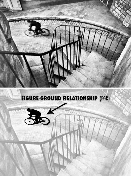 Photograph by Henri Cartier-Bresson showing an excellent FGR.
Or we can use the Law of Continuity , which will allow us to create a large arabesque using multiple objects.
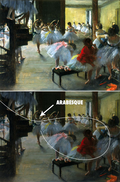 Painting by Edgar Degas showing an arabesque.
We can even use the maximum contrast area to help direct our viewer's eyes towards the main subject.
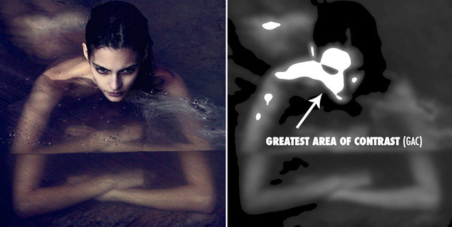 Photograph by David Bellemere.
MYTH #2: "Pros use it"
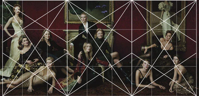
The next myth to dispel is "professionals use it". Annie Leibovitz is definitely a professional and one of the most inspiring photographers today. So let's take one of his photos and just align it to the rule of thirds grid, then we'll see if he's used it or not.
 Photograph by Annie Leibovitz.
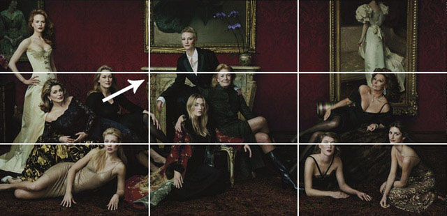 Showing the Rule of Thirds Grid lines up on the mantelpiece.
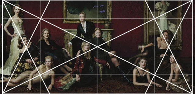
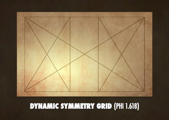
We can see how perfectly the mantel lines up with the rule of thirds grid. Hmmm, I guess he used it… but wait, how did the models pose? How did he create such a great composition when there are only horizontal and vertical lines to guide us? What do I do next? I have some of the Rule of Thirds models, but where do I go now? How do I position the arms, legs, dress and gaze? This is where we introduce dynamic symmetry.
 This is a Root 4 rectangle with its basic weave (two diagonal, four reciprocal, horizontal and vertical).
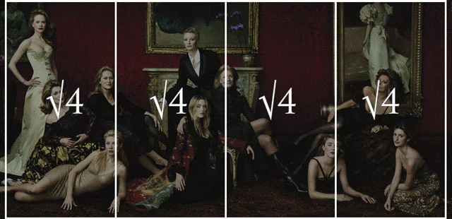 A Root 4 rectangle can be divided into four smaller Root 4 rectangles.
In order for Annie to pose the models correctly, she uses dynamic symmetry. This is basically a fancy term for the grid system.
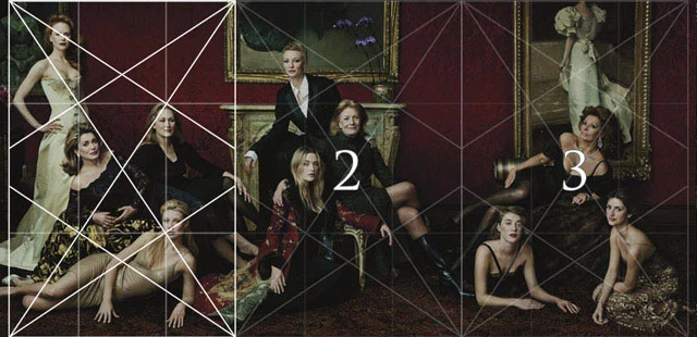 This is a 1.5 rectangle with its base armor (the same size as many camera sensors) and 3 can fit inside a 4 Root rectangle.
 This is the complete grid system.
To put it simply, a grid system is something we can use in our photography to help us organize our composition. We can use the diagonals, verticals and horizontals to help us create rhythm and unity throughout an image... whether it's a painting, photo or sculpture... dynamic symmetry can be used in everything .
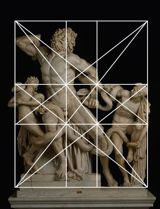 "Laocoon and His Sons" is a Greek sculpture constructed using dynamic symmetry.
We could go a long way in delving into this system, but let's not lose focus on the main purpose, which is to expose the rule of thirds for what it is... a watered down rule that has brainwashed us into thinking it's worth sharing with the world.
MYTH #3: "It moves the eye around the image."
This couldn't be further from the truth. Tracing the subject to one point without considering the whole will not help create movement within the composition.
When we learn another psychological Gestalt technique called the Law of Continuity , we will discover different tools that we can use to create movement and unity, which will move the eye around the image. The most visually pleasing one is an Arabesque .
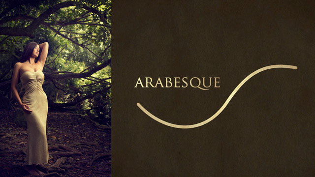
This is a curvilinear element that you can incorporate into your art to create a beautiful sweeping movement throughout the image. Master painters used them extensively in their work.
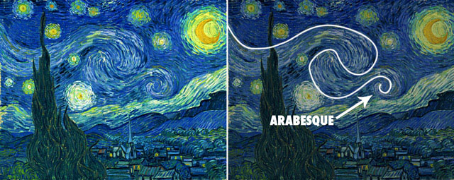 Painting by Vincent van Gogh showing an arabesque.
Another technique used to create motion is called Coincidence . This is defined as edge-to-edge relationships, which bring multiple elements together and can create side-to-side and up-and-down movement.
It's not as solid a line as you might think when you hear the term " guidelines ". It's interrupted, hidden, and a magic trick we can use to allow the mind to fill in the gaps easily.
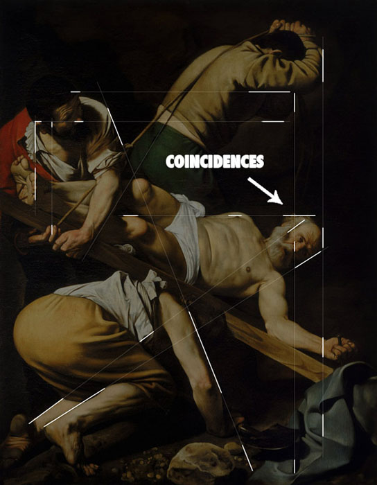 Caravaggio's painting shows how he hides his lines by understanding the Law of Continuity.
In this photo we can see the edge-to-edge relationships that Annie Leibovitz creates using the models' limbs.
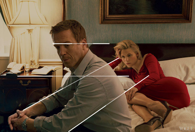 Photograph by Annie Leibovitz showing coincidences.
We can also see it in this painting of Da Vinci's Mona Lisa and in this complex composition by Bouguereau.
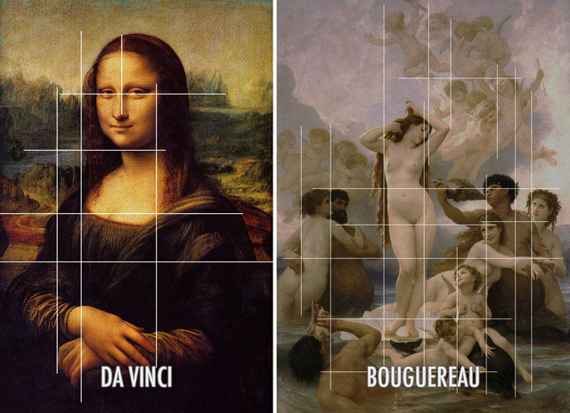 Paintings by Da Vinci and Bouguereau showing coincidences.
MYTH #4: "Take the subject off-center."
First of all, who decreed that the center of a shot is so bad? Why are we led to believe it?

There is a Gestalt psychology technique called the Law of Symmetry , which essentially means that the human mind is always trying to find balance in visual stimuli. So if we use the rule of thirds and position the subject off-center, we'll need a counterpart to help balance the image. If there's no counterpart, then we've just created a horrible balance within our composition.
There is vertical balance (which I call breath room ) and there is horizontal balance (which I call gaze direction ), and we need to figure out how to control each of these balances to create a properly balanced composition.
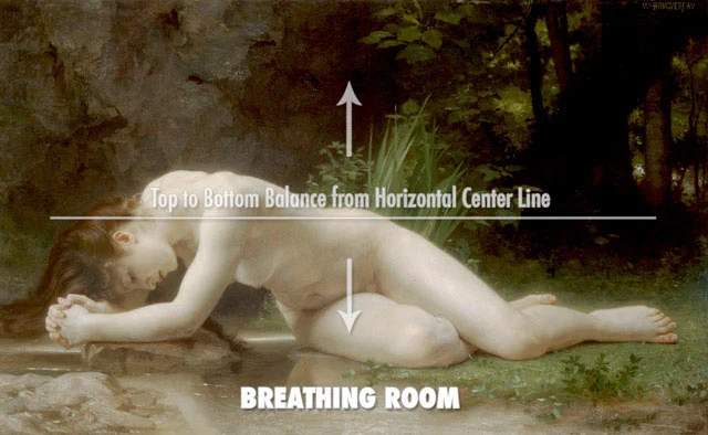 Painting by Bouguereau showing the right balance from top to bottom.
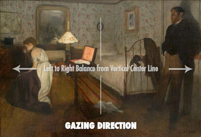 Painting by Degas showing the right balance from left to right.
Here is a photo that has the main subject centered, but is properly balanced because vertical and horizontal balance has been considered.
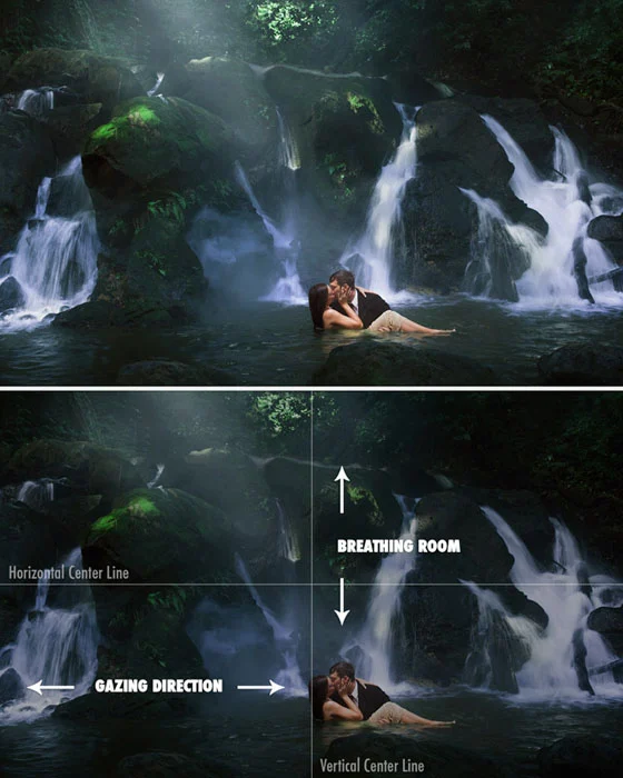 Photograph by Tavis Leaf Glover showing how Equilibrium can be achieved correctly from top to bottom and left to right.
MYTH #5: "Basis for a well-balanced and interesting shot"
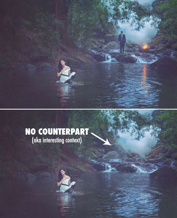
We've already talked about the Law of Symmetry, which covers getting an image right in balance, but we haven't mentioned how the rule of thirds gives birth to unwanted negative space . If we generically position our subject in one of the focus points without considering the whole, then we will not have a counterpart on the other side of the composition and we will have a negative space that diverts attention from our subject.
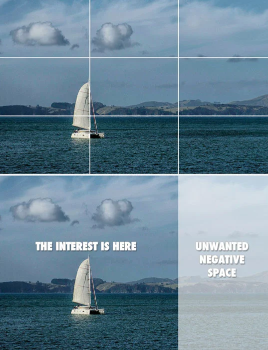 Photograph showing how the rule of thirds creates unwanted negative space.
Negative space can be used well to create a feeling of isolation or loneliness, but using it without sophistication or awareness is a rookie move.
MYTH #6: "It's a great starting point for beginners"
In my experience, the rule of thirds only leads to a dead end. At the beginning I considered it revolutionary and let myself be completely guided by the rule of thirds.
Later, I realized that I had stranded myself on a plateau and couldn't figure out how to properly compose an image anymore because I was relying on the rule of thirds. In short, I began to understand that it limited me.
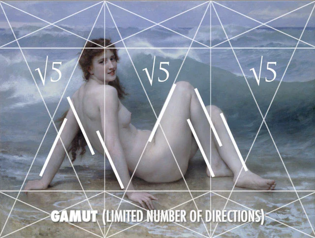
If beginners start with the dynamic symmetry grid instead of the rule of thirds, they will later be able to use diagonals in addition to horizontal and vertical lines, with which they can create rhythm... by posing the model or applying brush strokes. The available diagonals within the rectangle will limit the number of directions you use, called the gamut, which will create a more powerful composition.
 Painting by Bouguereau showing how he creates the rhythm in the model's pose based on his grid system.
MYTH #7: “Renaissance artists, or Greek artists, created the rule of thirds”
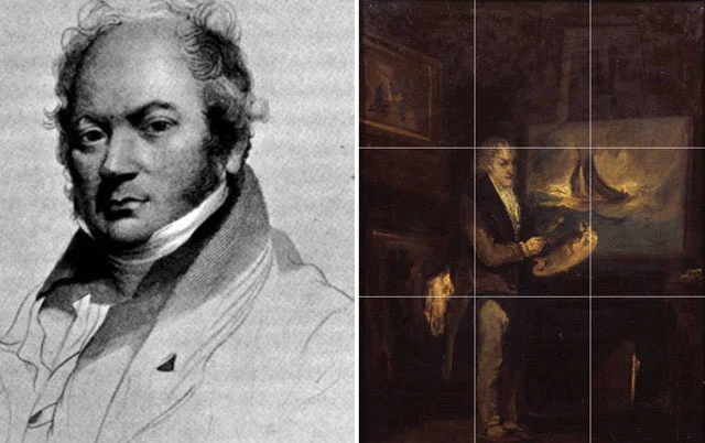
The rule of thirds was first documented in a book by Smith (around 1797), and if you take a look at his painting, you'll see that he was no master at all.
Da Vinci would roll over in his grave if he heard anyone say he was using this rule. The amount of education, study and practice he put into his compositions, can anyone reduce it to something as simple as the rule of thirds? There is no way!
Da Vinci, along with other master artists, including the Greeks, used dynamic symmetry, the golden section, and other design techniques such as arabesques, gamma, coincidences, radiating lines, figure-ground relationships, ellipses, and enclosures.
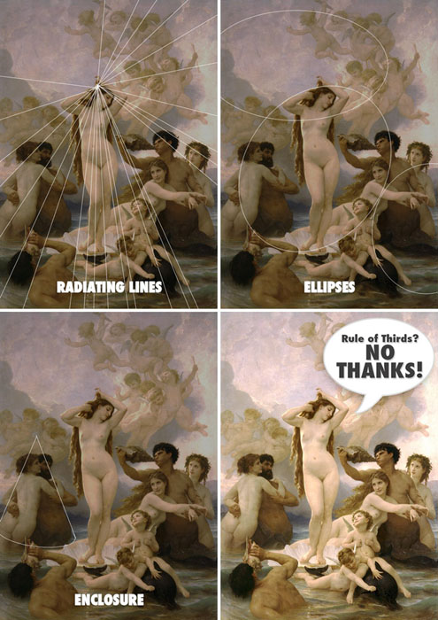 Painting by Bouguereau showing different design techniques.
MYTH #8: "The human eye naturally gravitates towards intersection points"
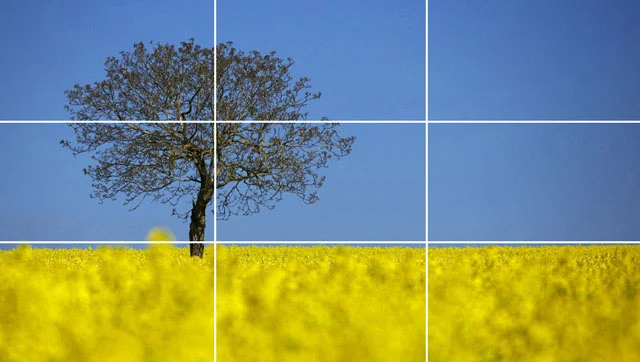 Photograph of a generically positioned tree and horizon line.
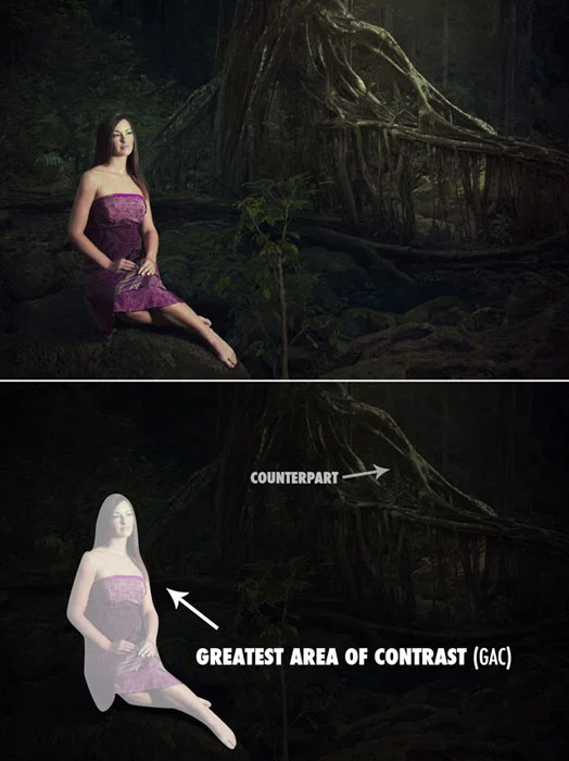
I really wish composing was that easy. Position your subject in a point of focus and BAM, you automatically control the viewer's eyes. Not so fast! What about the fact that we are drawn to high contrast areas?
When we make our subject the Greatest Area of Contrast (GAC) , won't we look there first... no matter what position they are in?
Another thing that catches our eyes is something I call Edge Flicker . Refers to high-contrast elements near the edge, greatly distracting the viewer from the subject.
Creating a hierarchy of contrast and keeping the edges free from distractions will help you control how your viewer's eyes move within the composition.
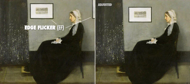 Whistler painting showing no edge flicker when adjusted.
MYTH #9: "Cropping the rule of thirds after taking a photo is a great way to save an image"
Cropping a poorly composed, poorly lit image won't save anything. This starts at the end and works backwards.
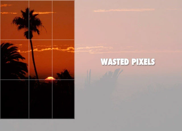 Try not to crop. Get it right in the camera to save precious pixels.
Learn composition techniques and Gestalt psychology so you know what to look for, how to fix vision problems, and do it directly behind closed doors. Don't sacrifice precious pixels for the rule of thirds. Your creativity deserves better.
MYTH #10: “Power points, or golden points, create tension”
Putting your subject on a third party won't create tension like we've learned so far.
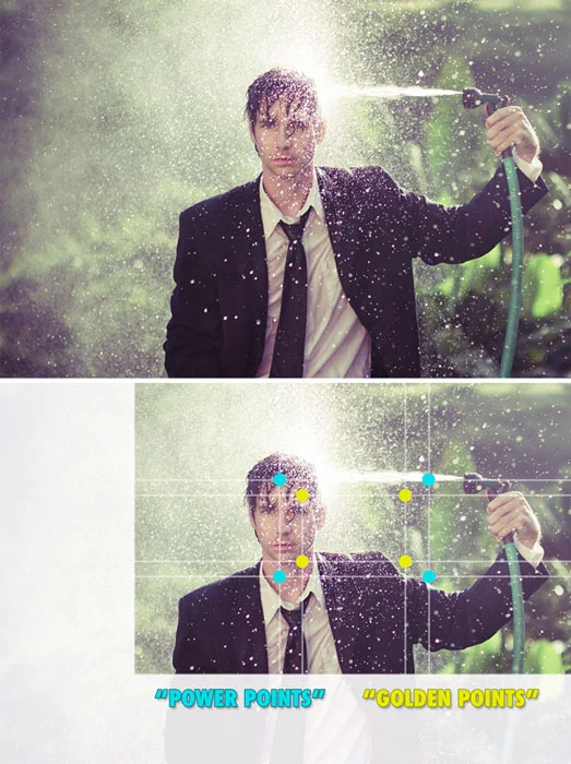 Photograph showing how cropping does not create tension.
If we take a look at a psychological Gestalt technique called the Law of Proximity , we will see how visual tension can be created. Like this Sistine Chapel ceiling painting…they are clearly unified by their proximity, but another thing to notice as we see this is the visual tension created by the fact that they are almost touching, but not quite. It's the moment before impact.
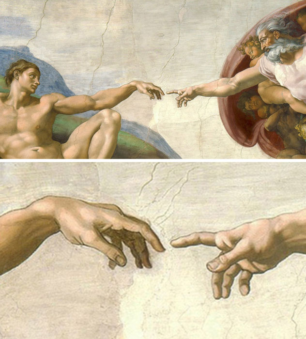 Painting by Michelangelo
Or this photo where the man is almost within reach of his dying wife. It is that closeness that creates the tension.
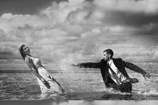
When considering the Law of Proximity, distance can create a negative space, which in this photo creates a tension in the room.
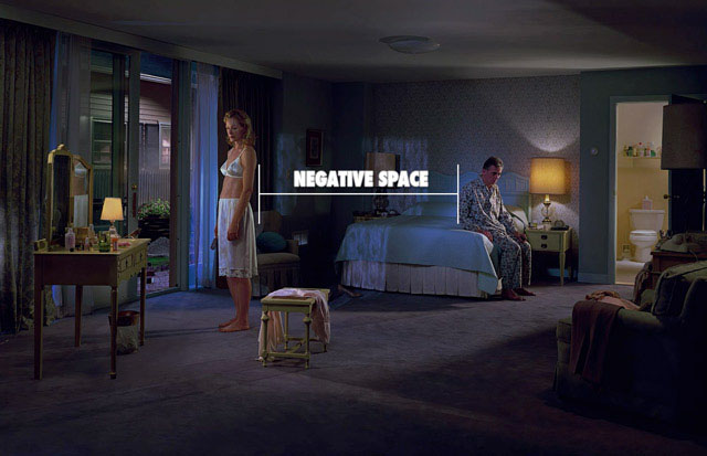 Photography by Gregory Crewdson using negative space to create tension.
Conclusion
So many tricks and techniques can be applied to create a stunning composition, which communicates clearly to your viewer. Abandon the rule of thirds. Leave that behind and adopt the dynamic symmetry grid which is just as simple to use, but can leave many more options open for you as your art progresses.
When you subscribe to the blog, we will send you an e-mail when there are new updates on the site so you wouldn't miss them.
About the author
By accepting you will be accessing a service provided by a third-party external to https://www.insightadv.it/


Comments