Know the fonts to use them in the best way.
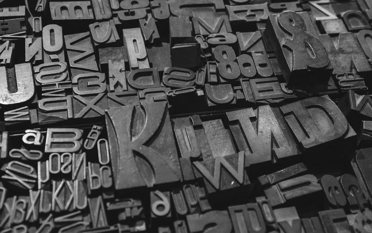
What is a font? And how do you use fonts? How can you create quality typographic projects, using fonts in the best way?
This article aims to be the answer to this and many other questions that many young designers ask themselves every day.
A first guide that seeks to create a complete introductory resource to all the main topics in the world of type, introducing topics that we will then explore in other articles.
Ready to start?
What is a font? And what is a typeface? Is it a glyph?
Before understanding how to use fonts, it is good to know what a font is. And what's the difference with a typeface, glyph, et cetera.
Why yes, typeface and font don't mean exactly the same thing.
Characters are, in graphics, typography and publishing, like bricks in architecture, atoms in physics or numbers in mathematics.
In short, they are the basis of graphic material.
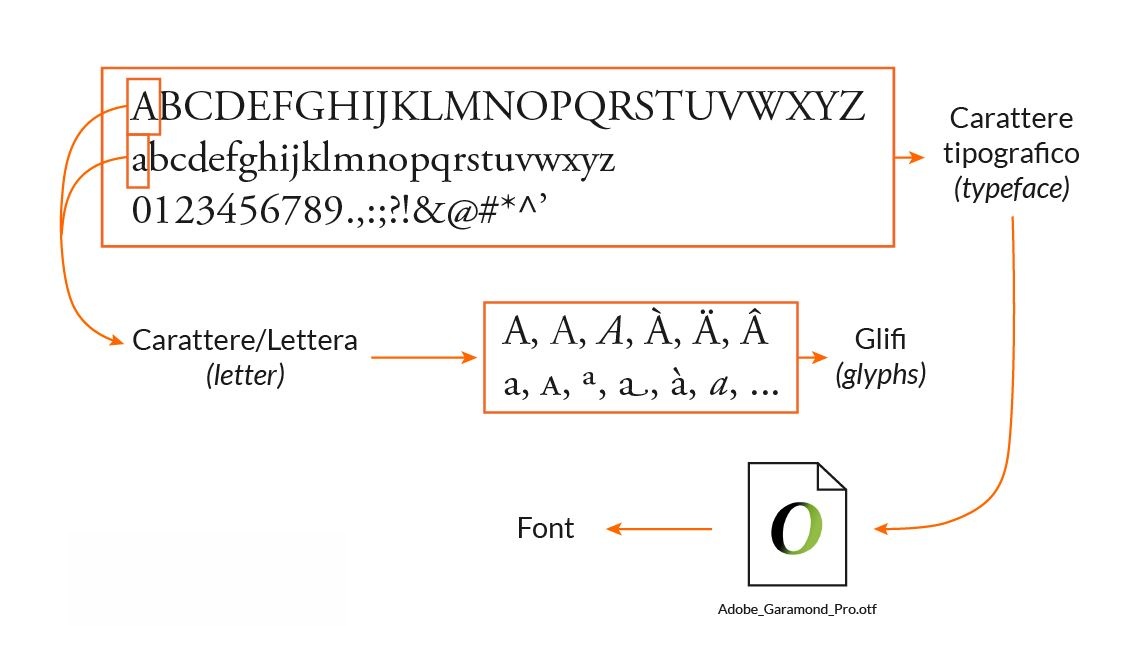
A set of characters studied in a coherent way and according to the same formal principles forms a typeface, the file of which is called a font.
In this infographic I tried to explain it visually:
But let's clarify these aspects better.
Fonts, typefaces and glyphs
The character is a letter, punctuation mark, or symbol.
So, for example, the letter "A" is a character .
This character in turn can be composed of several glyphs , such as A, a, a or a , which will then be glyphs of the same character and typeface.
The set of all the characters and glyphs of the Latin alphabet designed according to the same visual coherence and meaning, once again takes the name of typeface .
And it is here that misunderstandings arise in Italian.
English is clearer: the character (understood as a letter) is character , glyph is glyph and the coherent whole of all this, the typeface, is typeface .
The font, on the other hand, is the file
Font is something else: font is the medium that allows you to apply a character .
That is: while Garamond is a character ( typeface ), the garamond_semibold.otf file is a font (better: one of the fonts that make up the Garamond font family ).
To explain it we can make the comparison with music: if a typeface (character) is a song, the font is the .mp3 file that allows us to listen to it. It is therefore wrong to say "Listen to this mp3 refrain!", while it is much more correct to say "Listen to this song to refrain!".
Therefore, often using the word "font" instead of character is a child error of the digital age: confusing software (means) with its purpose (end). A bit like saying "but this is a Photoshop" looking at a photomontage.
And it's a mistake I've made myself for years and still fall into from time to time. So, learn from my mistakes!
Why is it called "font"?
Many think that font is a term of English origin but, in reality , its origin is French . It is in fact the English transposition of the term "source" of medieval French.
This word, which was pronounced “font” (in French the final e is truncated and not pronounced) originally meant “fused” . The Latin root of the word is the same as the Italian verb "fuse".
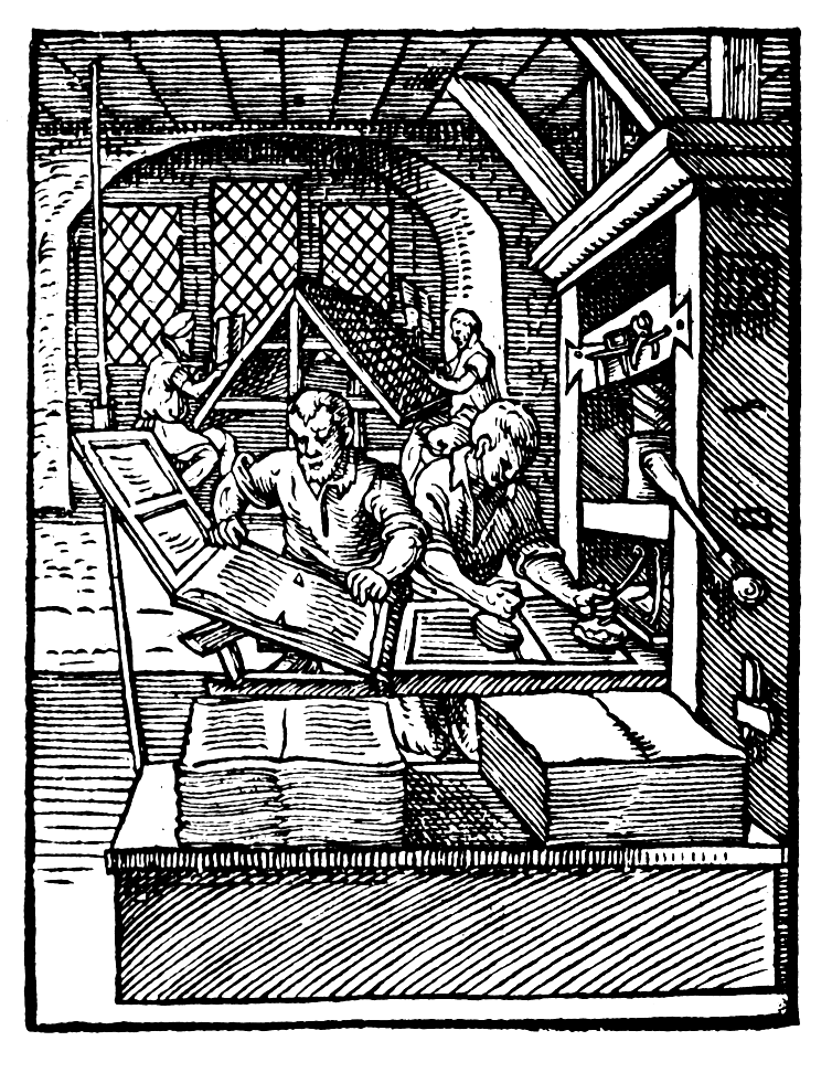
The reference is precisely to Gutenberg 's movable type machine which obtained the characters, precisely, from the fusion of metal.
The word font was then imported into England where it spread to all English-speaking countries and from there to the whole world over the course of the last century.
Big question: do you say IL font or LA font?
An eternal diatribe in the world of Italian graphics. La Crusca said that it can be used in both ways but I have decided to side definitively: it is called THE font . And now I'll tell you why.
Font is a masculine word. And it is first of all because, being an English foreign word , as well as all foreign words of Anglo-Saxon origin used in Italian such as computers or smartphones , it assumes the neutral gender which has the grammatical rules of the masculine gender.
But more importantly, confusion about masculine/feminine is often generated by a great misunderstanding about the origin of the word itself.
The medieval French term source does not have the same meaning as the Italian term "source" (eg: the source of the river)!
As mentioned above, source means melted! So also in this case the use of the feminine is meaningless.
So, in summary: THE font, A font, OF fonts, etc. Clear?
With this chapter closed, let's analyze in detail how a font is made and from which elements it is composed.
What are the font variations and types of typographic characters?
Let's see what are the terms that identify on the one hand the various files that make up a family of fonts and, on the other, the types of main typographic characters
Variants of a font (weights, italics, etc.)
As mentioned, a font is a file and each file corresponds to a typeface in which all the glyphs are inserted that have been designed to work together, as a single body.
Generally, font files are grouped into font families, where there are variants of the original typeface.
The main variants are these:
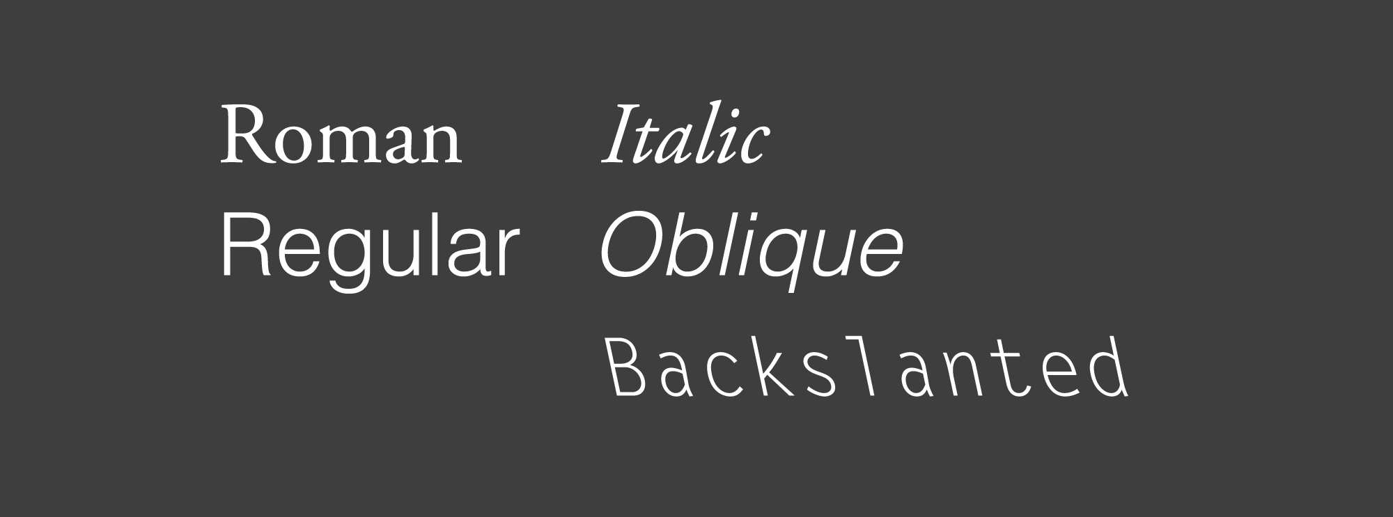
- The “normal” versions , usually called Roman or Regular
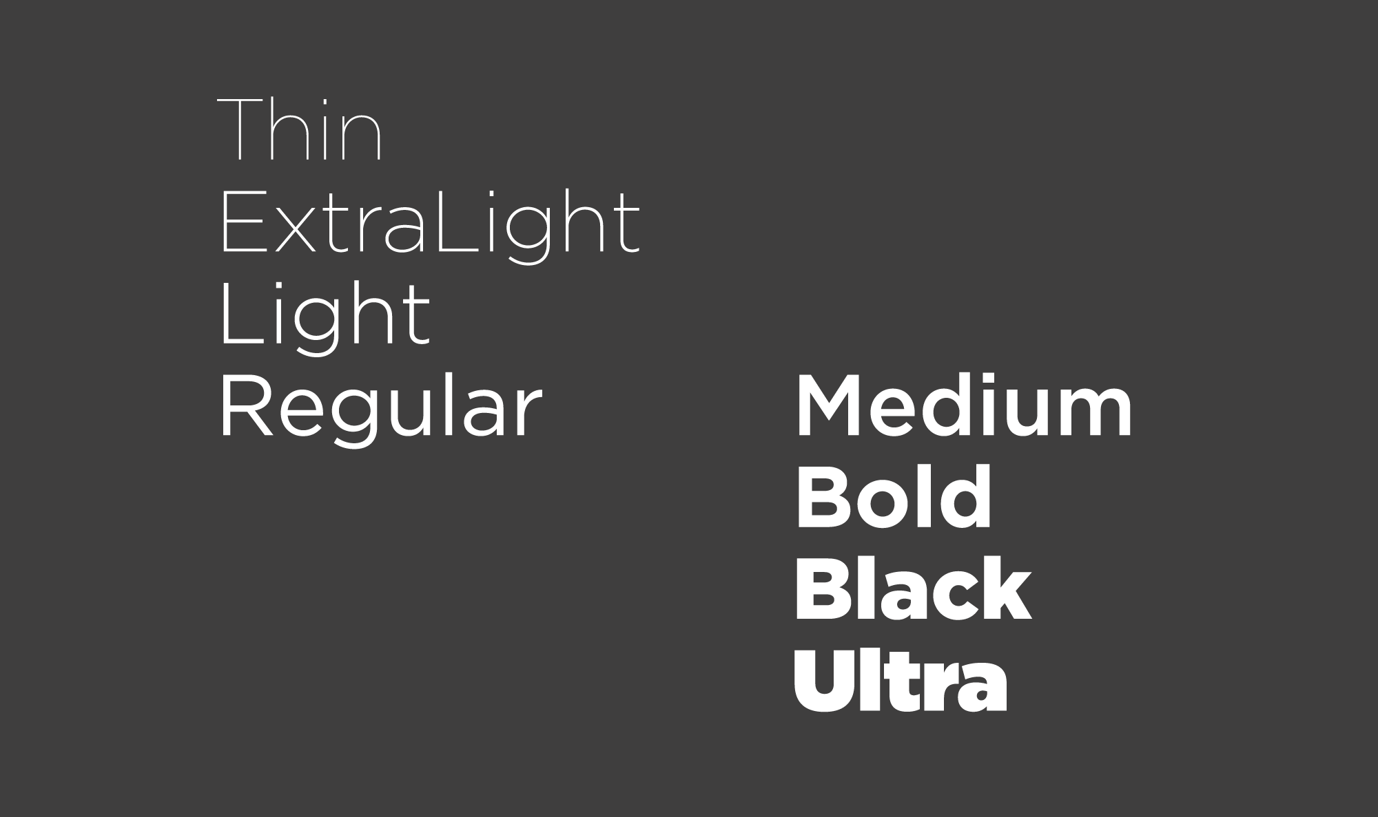
- All the weight variants (i.e. the thickness of the font) that can go from the thinnest ones (Light, Thin, Extra-Light , etc.) to the thickest ones ( Bold, Black, Extra-Bold, Ultra , etc.)
- Italics, or italic , which is just a different font , designed with different optical and aesthetic choices (it's not simply a slanted Regular font). Cursive fonts also have their weight variants ( Bold Italic, Light Italic , etc)
- The oblique, or oblique, is instead the inclined variant, without any aesthetic and functional modification, of the normal font. To better understand the difference with italic, here is an example with Garamond, Garamond Italic and Garamond oblique:
- The compressed (Condensed) and enlarged (Extended) versions . Again, it is not a simple normal “stretched” font but a different font, designed to be wider or narrower.
The types of typographic characters
Typographic characters are not all the same, in fact, they are very different!
In graphics schools or universities it is often said that fonts are divided into two categories, serifs and sans serifs, two French terms meaning "with thanks" and "without thanks". In reality there are several other types (we will see them in detail in one of the next articles), even within these two macro-categories.

The substantial difference between these two categories of fonts is the use or not of the "serifs", i.e. those small extensions at the ends of the temples, which derive from manual calligraphic writing.
How is a font made?
As mentioned before, a character, i.e. a single letter in all its variants, is made up of several different glyphs. Glyphs, in turn, are made up of many different structural elements, which go by different names, of course. Let's see them!
The elements that make up a glyph
There are a lot of names and definitions to define each single element of a letter. There are even dozens of different names to define the type of grace of a character.
Obviously it is not necessary to know all these names, it would be pure and futile notion for its own sake. However, it is important to know at least the most important ones.
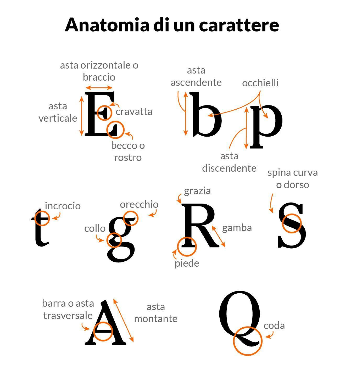
The elements of a typeface
Obviously a typographic character is not only composed of letters arranged haphazardly on the page but also of grids and visual structures that allow usability and easy reading of the written text.
Precisely for this reason I decided to create this other little infographic which explains the structures used to make a font work as a whole and on which the design of a typeface is based.
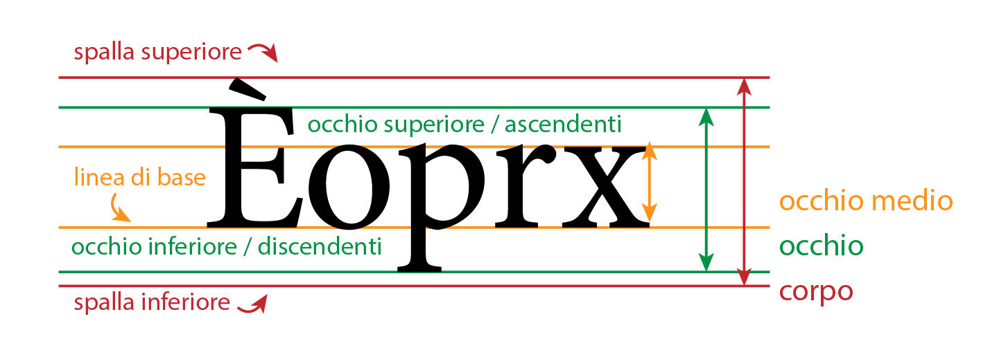
There is often a lot of confusion with these terms, in particular the middle eye, eye and body are confused.
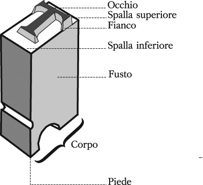
The middle eye , i.e. the English x-height (height of the x) is the height of the lowercase letters, the eye is the height of the uppercase letters also including the lowercase ones with descending rods and finally the body is the height of the uppercase including accents and special characters.
The body of the head also includes a space below the lower eye line (up to the lower shoulder) due to the physicality of the metal punches, as can be clearly understood from this image by Giangiorgio Fuga:
How to use fonts?
In a complete guide on typography in graphics, one cannot but talk about how to actually use these fonts.
The 7 golden rules of typography
When you work with texts, in graphic design, you have to do it following some rules. In reality, more than rules, these are real practical advice for working more effectively with texts and fonts and creating better graphic projects.
1) Align text left. If you need the texts you use to be very readable, avoid centered or justified alignments, but always try to prefer left alignment flag.
2) Choose a maximum of two fonts at a time. Indeed, better, only one. The thing to absolutely avoid is a composition in which there are too many fonts. Don't mix fonts that are too different or too similar.
3) Choose only high quality fonts. You can choose any font as long as it is of quality.
4) Good typography is based on good use of white space . First there are the white spaces between paragraphs, which must always be inserted. This not only improves the visual appearance at first glance, but also makes the message clearer, thanks to the white spaces. They offer "scheduled breaks" to the reader. Then there is the line spacing, or the space between one line and another of a text, which should always be between 115% and 150% in texts to ensure adequate readability. Furthermore, when managing paragraphs, always try to avoid justified alignment which usually leads to excessive spaces between words (or even worse between letters).
5) Avoid silly text edits. Do not stretch fonts. Do not change tracking to lowercase letters.
6) Use punctuation and accents correctly. One of the ways to understand when there is little attention to detail in a text is precisely the use of punctuation and accents. Try to always take care of these details, for example:
- Always set punctuation outside the paragraph border
- Always insert a space (and only one) after a punctuation mark such as a comma, period or any other sign.
- Try to avoid trivial mistakes: the ellipses are 3... not 2.. or 4.... Accents are important in Italian. The accent of is and why they are different.
- At the same time, using an apostrophe for capital accents, such as E' instead of E', is a typographical abomination.
7) Use font weights and sizes correctly. For texts, always use "regular" or "roman" font weights, in order to guarantee the best legibility. Use bold or, even better, the weight of at least two levels thicker (like "black" or "heavy") and italic to underline the important things in a text. In this way, the fast reader will be able to read faster, assimilating the necessary things. Don't use text that is too small (never under 8pt on paper and 11pt on screen) nor, of course, too large (over 22pt, for text, well maybe you're exaggerating)
How to choose the right font
How many times have you found yourself in the situation of having to decide which font to use ?
How many times have you searched for the most suitable font for your project by scrolling through the font curtain for hours , rummaging through the hundreds of fonts you have downloaded or purchased?
Deciding which font to use is a very important, sometimes almost essential, part of the creative process and the success or failure of an entire project may even depend on this decision.
An example: do you think Obama's famous 2007-2008 advertising campaign for the presidency (the famous “ Yes we can! “) would have been so successful without the Gotham font? I do not think so.
But I will come back to it in the next articles and I will explain in detail how to choose the right font for the goals we set ourselves, both on the basis of its technical characteristics and its psychology.
How to combine multiple fonts with each other
Choosing a font is a complicated process and requires careful analysis of your design. But knowing how to match fonts can be even more difficult.
Therefore, there will also be an article on our blog that will explain how to combine fonts with each other.
Some spoilers on the advice you will find in the article we will write:
- Mix serifs and sans serifs to ensure a nice visual contrast
- Create a visual hierarchy, that is, determine well the level of importance of each font that you are going to insert in your project
- Avoid using different fonts that are too similar to each other (such as Univers and Helvetica together)
When you subscribe to the blog, we will send you an e-mail when there are new updates on the site so you wouldn't miss them.
By accepting you will be accessing a service provided by a third-party external to https://www.insightadv.it/





































Comments