
Landscape composition: connecting the dots
So far in my series of landscape photography articles, I've talked about compositional elements , their weights, and how to use their properties to balance your composition by imagining a balance of pairs around an image's central axis. I also talked about the balance of negative space , the perception of direction of the subject and the often overlooked importance I place on the separation of elements . I then discussed depth perception and how to use the sky in a landscape image.
Before starting this article, which will close the series, I would like to return to the elements of composition and delve into the concept of binding compositional components together, in the hope that this will connect all the dots we have discussed in previous articles.
Remembering what has been written, we know that the compositional masses counterbalance each other. If we arrange the elements well, these masses will be separated without overlapping, and will have their own negative space around each of them proportional to their compositional weights. All of this might seem to mean that the different elements of a composition are disconnected from each other. But in a good picture, the compositional elements are far from disconnected. I would like to resolve this apparent discrepancy by explaining how compositional masses can be tied together using shapes and lines.
While acknowledging the need to balance the masses around the central axis, I would argue that this alone is often not enough to determine the best framing arrangement. There are many degrees of freedom, in the sense that there are many compositions in which the masses are arranged to satisfy the equilibrium we so desire. There is room, then, for further ideas to be considered for arranging elements relative to each other in a way that is more pleasing to the eye of the viewer.
 What is it, other than the fact that the main masses are well balanced around the central axis, that makes the different elements of this image work together as a whole and not as differentiated points of interest?
The first of these ideas is that we should consider the overall shapes created by the main elements (masses and lines) in a composition. To do this, we can imagine the image as devoid of any information other than these elements and create a kind of mental diagram (or graph) representing the interactions between them. The goal should be for the main elements to create some kind of flow, a continuum that makes sense to the eye and to the mind; this helps to connect the viewer with the photographer's feelings and vision during the creation of the image.
A very simple example of this is framing. When some elements of the composition form a frame around others, they form a connection: the frame accentuates what is inside, focusing the viewer's eye on it and giving it more importance.
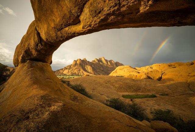 This beautiful rock arch forms a frame to focus the viewer's eye on the mountain and double rainbow. Spitzkoppe, Namibia.
Sony A7R, Canon 16-35mm F2.8 II
ISO 100| 1/10 sec | F11
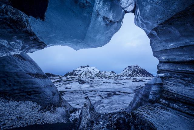 This opening glacial cave frames the mountains in the background, but is also shaped like a bird. Mýrdalsjökull, Iceland.
Sony A7R, Canon 17mm F4 TS-E
3-shot panorama at ISO 100 | 1 second | F14
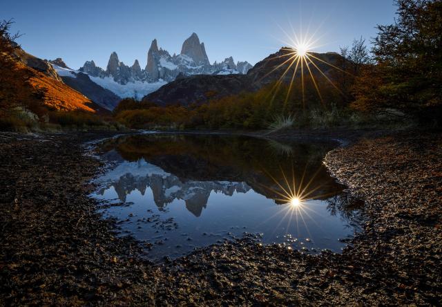 Here, reflection is framed, increasing the viewer's awareness of its contents and giving it more prominence and importance. Poincenot Field, Parque Nacional Los Glaciares, Patagonia Argentina.
Canon 5D IV, Canon 16-35mm F2.8 III
Focus at ISO 100 | 1/25sec | F16
But the shapes you can compose from the main compositional elements aren't limited to frames. There are many more examples. S-curves also come to mind, connecting main masses with winding lines.
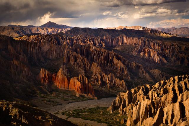 There is a clear S-curve that guides the viewer's eye from top left to right, left, and right again. This unconscious turning of the image makes it more surprising for the viewer. Tupizza, Bolivia.
Canon 5D III, Canon 70-200mm F4
ISO 200 | 1/40 sec | F13
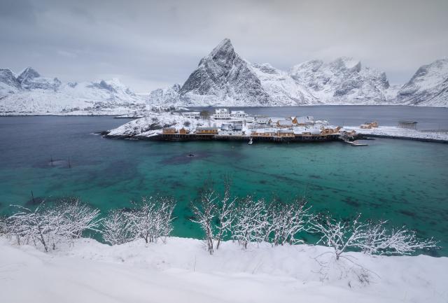
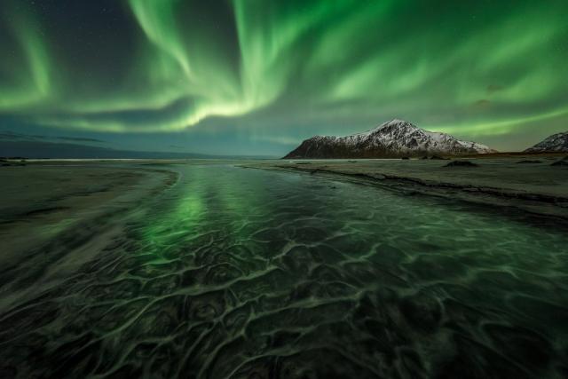
 Here, the S-curve is not present in the picture, but the arrangement of the masses creates an imaginary connection that is shaped like an S. The effect is almost the same. Flakstad Fjord, Lofoten Islands, Arctic Norway.
Canon 5D IV, Canon 11-24mm F4
Focus stack at ISO 100 | 1/20 sec | F11
The benefit of an S-curve is that its shape (real or imagined) meanders back and forth, causing the viewer to consider different areas in the composition, creating a connection between them. It also encourages the viewer's eye to wander back and forth in the image, giving him the pleasure of exploring it.
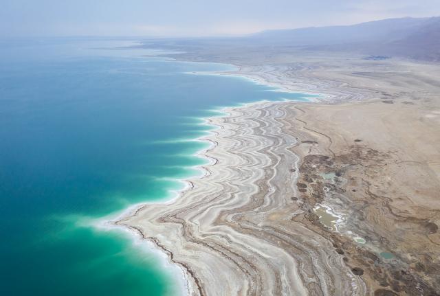 The shores of the Dead Sea wind back and forth between left and right. Ein Gedi, Israel.
DJI Mavic II Pro
ISO 200 | 1/20 sec | F4
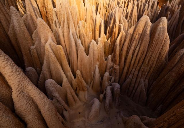
The shapes created by the compositional elements can vary. In the image below there is a very nice multi-pyramidal shape: not only is the mountain shaped like a pyramid, but the lines of its sides, when they continue, form another pyramid with the island as a base, and then again another pyramid with trees in the foreground.
Let's draw the diagram, just to show it more clearly:
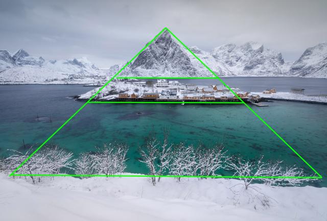
I argue that having this kind of extra connection between different elements improves an image tremendously.
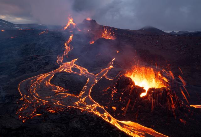
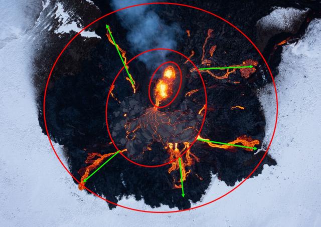
Another example is an image I've already talked about in the series.
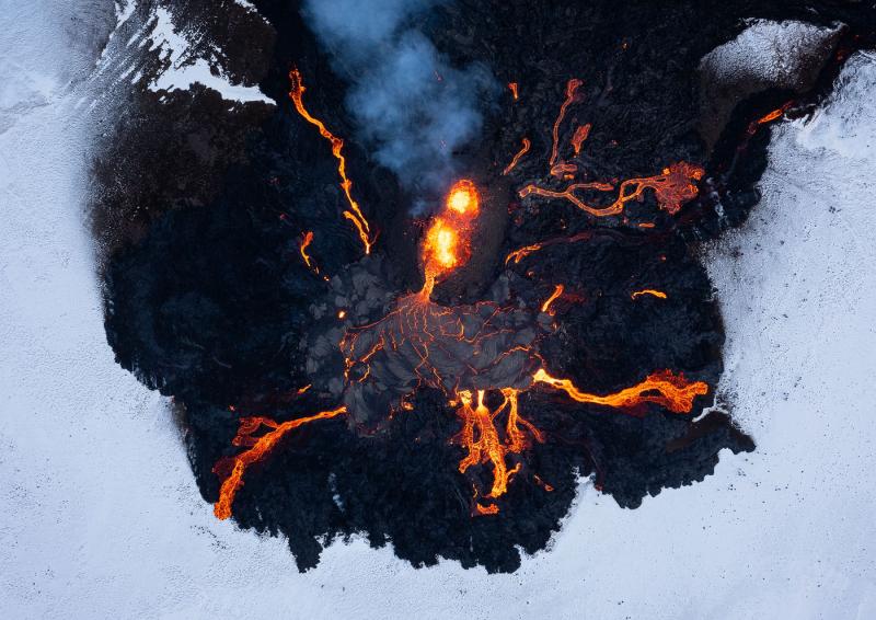
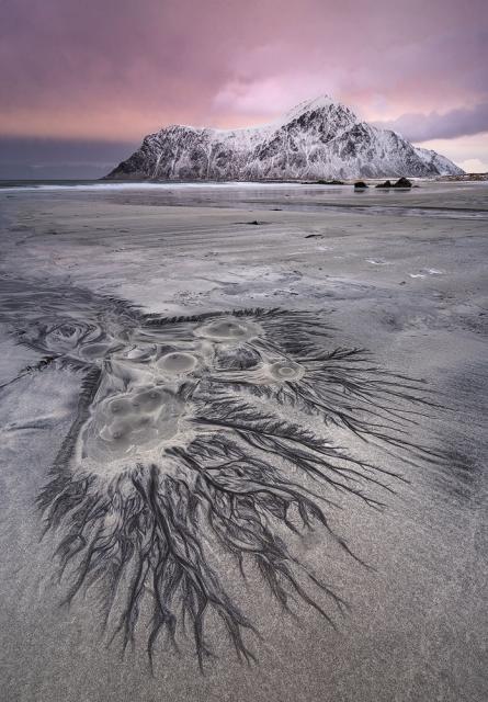
In this image we have several concentric circles, connected by radial lines. The star shape draws the eye to the central subject (the eruption and the pool) and connects it to the outer layers.
I hope the ideas and shapes above convince you of the importance of connecting elements of your image in more ways than one. To continue, I would like to show you another pyramid shape and ask what is it about the main elements, other than this shape and the balance around the central axis, that contributes to the composition.
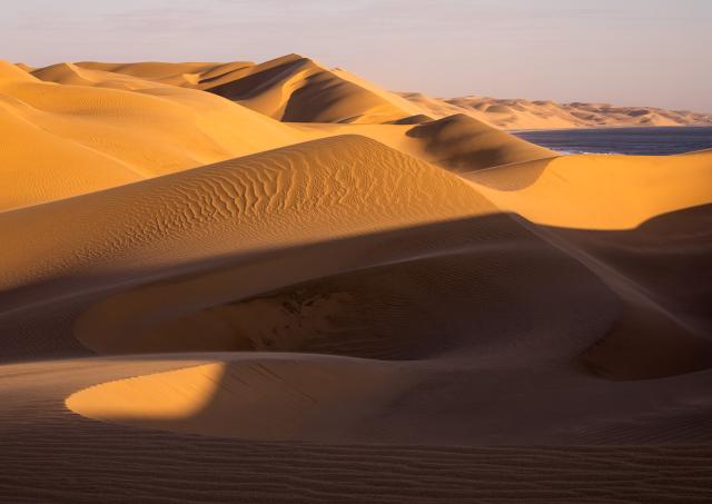
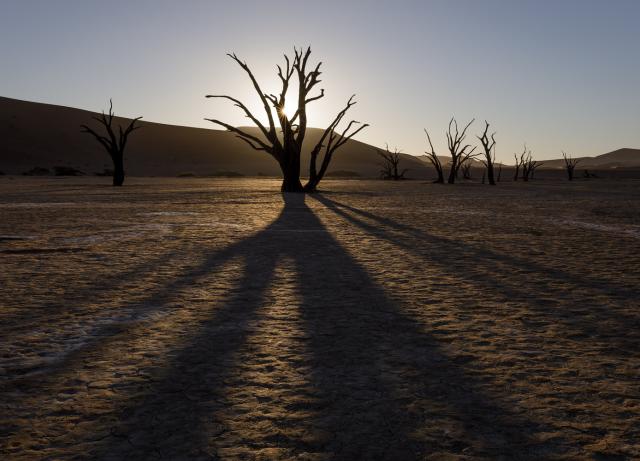 A clear pyramid shape links the main compositional mass to the foreground by means of lines. What property do these lines have that further enhance the composition?
Deadvlei, Namibia.
Canon 5D IV, Canon 16-35mm F2.8 III
ISO 100| 1/100 sec | F16
To hint at what I have in mind, here is a comparison of 2 images from the same place: Skagsanden Beach in the Lofoten Islands.
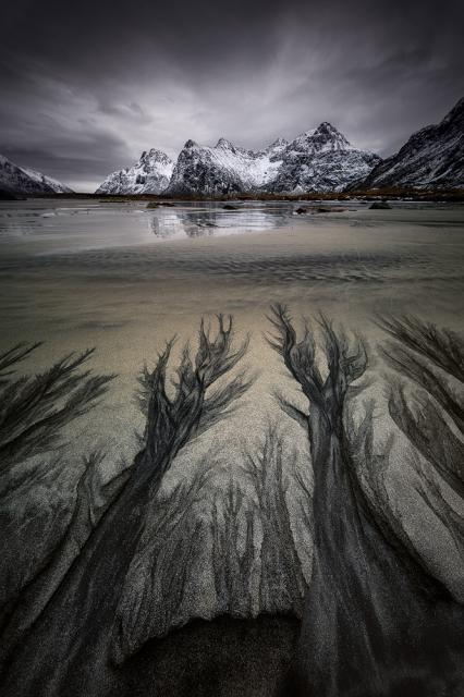
I argue that these images, while superficially similar, differ in one very important way. In the top image the lines lead towards a compositional mass, while in the bottom image the lines move away from the subject in the background.
Lines are powerful composition tools. As mentioned earlier, they can be used to connect different compositional masses, creating a composition that works as a whole. But more importantly, lines are a tool for creating depth .
In previous articles I have talked about the sense of depth and how important it is for a landscape image. Using wide angle lenses, elements of separation, correct use of negative space - all this contributes to the feeling of depth. But lines can perhaps be more powerful than all other elements in making viewers feel as if they are inside the world depicted in the image.
This is not a scientific fact, rather a gut feeling, but I think that when a line connects the foreground and the background, it makes the two unconsciously compare, going back and forth and thus emphasizing the distance between them. A line can also enhance the main compositional masses simply by being an arrow, pointing towards them or emanating from them. Let's look at some examples of lines that connect and/or underline masses.
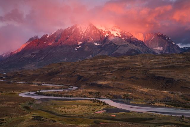
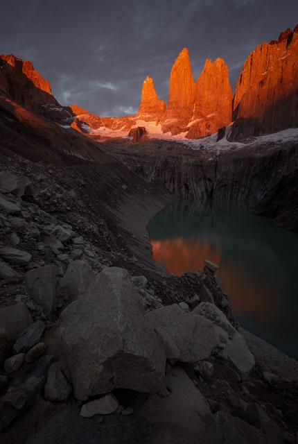 The curved bank of this glacial moraine connects the rock in the foreground and the mountains in the background. It also enhances the stark difference in lighting between them. Torres Del Paine, Chilean Patagonia.
Canon 5D IV, Canon 16-35mm F4 IS
Focus at ISO 100 | 0.5 seconds | F14
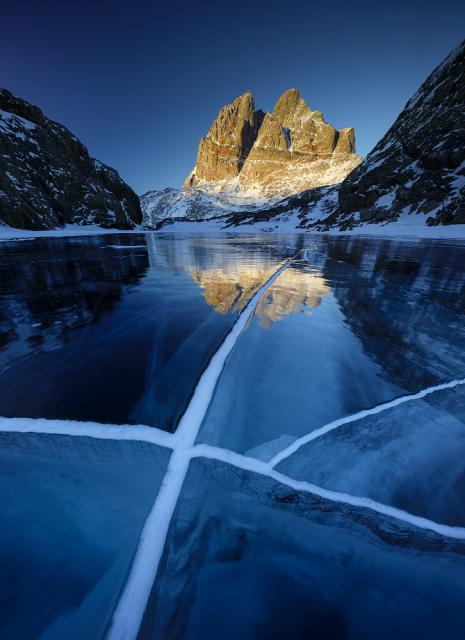 Here the main line connects the mountain to the foreground subject, the intersection of several cracks in the frozen lake. Then continue down to connect to the bottom of the frame as well. Lake Tasersuaq, Uummannaq, Greenland
Canon 5D IV, Canon 11-24mm F4
Focus stack at ISO 100 | 1/8 sec | F10
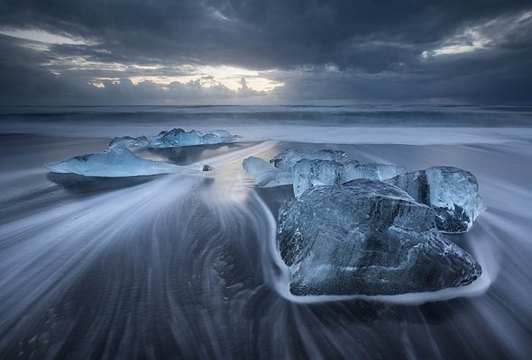
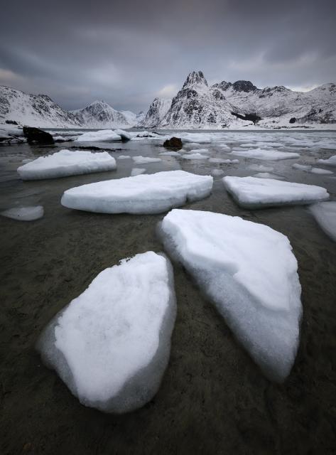
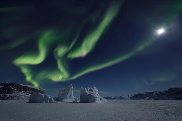 Here the lines do not lead to the subject but emanate from it. This gives these rather small icebergs a heavier compositional weight, bursting them with importance and making them capable of catching the viewer's eye despite their diminutive size. Uummannaq Fjord, Greenland.
Canon 5D IV, Canon 11-24mm F4
Focus stack at ISO 1600 | 3.2 seconds | F4
Finally, I'd like to express how important it is when the guidelines connect to the bottom of the image. This increases the feeling of depth, but above all connects the viewer to the scene, making him feel part of the depicted world.
 The stream, the main guideline in this image, comes from the bottom of the image, giving viewers the feeling of being in flowing water. Skagsanden Beach, Lofoten Islands, Arctic Norway.
Canon 5D IV, Canon 11-24mm F4
ISO 3200| 8 seconds | F4
It's good to study a counterexample to this. Consider the picture below.
 Paine Grande in the morning light. Torres Del Paine, Chilean Patagonia.
Sony A7R, Tamron 24-70mm F2.8
40mm | ISO 200 | 1.6 seconds | F13
The mountain looks beautiful in the red light of dawn, which is also reflected on the river. Overall I'd say the composition is well balanced, if not spectacular. But my main problem with this photo is that the river doesn't go to the back of the frame, but rather to the side. This flattens the image and compresses it unpleasantly.
I hope you enjoyed my unorthodox ways of thinking about composition. I've said it a thousand times but I'll say it again: this wasn't meant to be a guide on how to compose in the field, but rather an exploration of different ways to understand why some images work and others don't. Take what you want from this series of articles: the important thing is that you understand how fundamental composition is in an image. Because that will never change.
When you subscribe to the blog, we will send you an e-mail when there are new updates on the site so you wouldn't miss them.
About the author
By accepting you will be accessing a service provided by a third-party external to https://www.insightadv.it/


Comments