
Landscape composition: the separation of elements
So far in this series of articles on landscape composition I have told you about compositional elements, their weights and how to use their properties to balance your composition by imagining a balance of pairs around the central axis of an image. I also told you about the balance of negative space, the perception of the direction of the subject and the main area given to correspond to this direction.
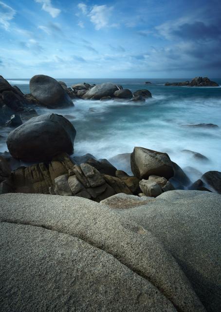
I ended the last article with the image below and asked you to guess what I don't like. Let's take another look:
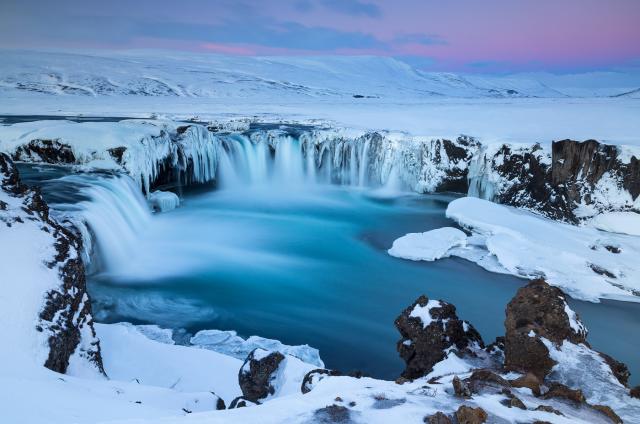
There seems to be nice light and colors, good overall balance, enough space around the elements and enough of the main one in the direction the waterfall is facing. But for the seasoned photographer, there is one thing that immediately strikes the eye and virtually ruins the composition: the lack of separation between compositional elements.

Separating elements is something some photographers don't even consider, but I believe it's one of the most important things to keep in mind when creating a shot to avoid potential distractions in a composition. Even in an otherwise perfect composition (perhaps even more so in a near-perfect composition), a point of unnecessary overlap can draw a lot of attention, distract the viewer, sabotage depth perception, and severely damage an image.
We then need to figure out what elements we need to separate, how far we need to separate them, and what else to keep in mind in that context. This can be tricky, especially when shooting in the field on a tight schedule, so spending some time thinking about it can benefit a photographer's job enormously.
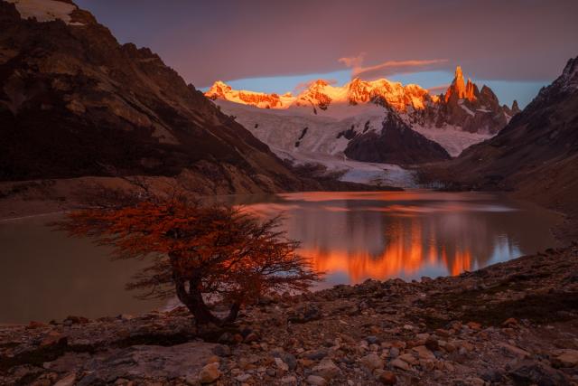 A nice image of a fine morning in Laguna Torre, but it suffers from a serious lack of separation between its elements: the tree overlaps the rocks in the foreground as does the mountain on the left. Also, the reflection of the right mountain lacks the space it deserves and is not separated from the foreground. Unfortunately, there was no way the photographer could have shot it from a higher height, which could have solved the problem. What bothers you more: the lack of separation between the tree and the mountain on the left, or that between the tree and the reflection of the mountain on the right? Why do you think this is so?
(Canon 5D4, Canon 16-35mm F2.8 III, 1/4 sec, F14, ISO200)
Separating elements is closely related to negative space (or lack thereof). After all, we often separate elements by putting negative space between them. While that's true, separation isn't always achieved by using negative space. This means that we need to explain the concept a little more. My idea of a definition for the separation of elements uses photographic and compositional tools to help the viewer distinguish the different elements of the composition. The goal is to make the viewer see the desired composition more clearly and more similar to what the artist had in mind when creating the image.
 The main compositional elements in this image are conveniently separated and this makes it easy for the viewer to understand what is happening.
(DJI Mavic II Pro, 1/3 sec, F11, ISO100)
If two elements overlap, they could potentially be perceived as a single element, which inherently changes the fundamental order in a composition. There is also considerable variation in how overlapping is evident. My feeling is that the greater the similarity between the compositional elements, the more an overlap between them disturbs the composition. So, the first rule of thumb would be to maintain separation – in the form of negative space – between similar items that are hard to distinguish otherwise . The more similar the elements are, the greater the need for physical separation. Let's take two extreme examples:
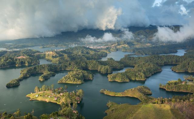 The view from El Peñón de Guatapé - a giant rock in Guatapé, Colombia. The different compositional elements, i.e. the islands in this tank, are very similar, and therefore the overlap between them is very disturbing to me.
(Canon 5D3, Canon 17-40mm F4, 1/6 sec, F8, ISO100)
The example above shows a case where the lack of separation severely damages the composition by overlaying similar but distinct elements. This made the picture tense and not in a good way. In the image below, the situation is exactly the opposite. No overlapping problems as the elements are very different in shape, color and brightness. One could say that elements are separated by their properties, rather than negative space. All of this goes to show that physical separation isn't always a must, and the photographer needs to consider whether an overlay helps or detracts from the composition.
 The quiver tree and the sun are extremely different, so the overlap between them is not problematic - the separation is achieved by other means. For me the overlap actually enhances the composition and makes it much more interesting. Note that the top of the tree on the left and the edge of the cloud above it are not different enough and therefore must be physically separated, as in the photo.
(Sony A7R, Canon 70-300mm F4-5.6, 1/8000 sec, F11, ISO100)
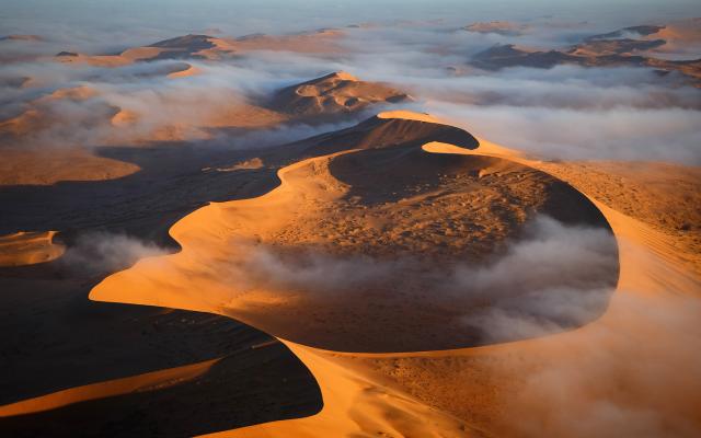
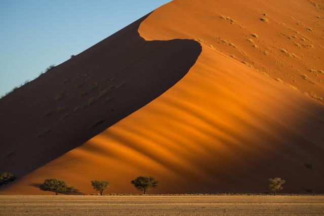
As nature photographers, we can use natural elements to create separation where there otherwise would be none. Consider the picture below. Without the fog, there would be little to no separation between the dunes, making it difficult for the viewer to distinguish between compositional elements and to judge the amount of depth in this image. I hope you agree that fog plays a major role in this photo.
I cannot stress enough how important the ability to judge whether the elements need physical separation as well. Overlay is most often positive and can help create depth, one of the main goals in landscape photography.
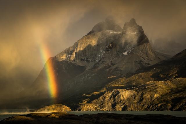 Because the rainbow is so prominent and different from the mountain in the background, there's no need for separation, even though both are the main compositional elements. The photographer specifically chose to place it in front of a darker part of the mountain, because the brightness contrast contributes to the sense of depth of the image. Recalling what was said in the previous article, one could also say that the rainbow and the mountain are facing each other, which serves the composition. What additional elements/aspects in this composition help create depth and make the image self-contained and interesting?
(Sony A7R, Tamron 24-70mm F2.8, 1/320 sec, F8, ISO400)
By comparison, when elements are too similar (primarily in color and level of brightness), they may appear to merge, which takes away from the sense of depth. The following examples show this well.
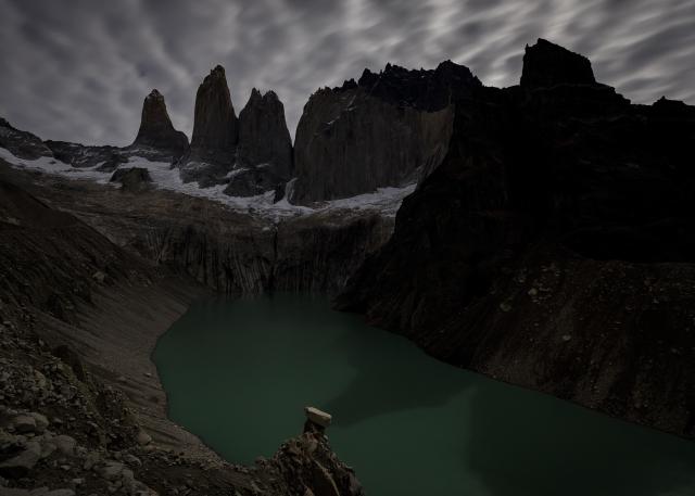 While shooting this nighttime image from the top of the moraine in the Torres Belvedere, the photographer neglected to notice that the shadow overlaps the stone spire. It's not good since it connects two elements that should be disjointed (and were far from each other actually), thus hurting the sense of depth in this otherwise good comp.
(Canon 5D4, Canon 16-35mm F2.8, 15sec, F4, ISO1600)
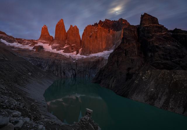 This image was taken a little later, as the pre-dawn sunlight colored the clouds and, in turn, the Torres themselves. Composition is far better without the overlay. I also don't mind the lack of separation between the moraine and the Torres reflection. Do you agree that the moon adds a lot? Why do you think this is the case, based on what we've learned so far in this series of articles?
(Canon 5D4, Canon 16-35mm F2.8, 30sec, F11, ISO800)
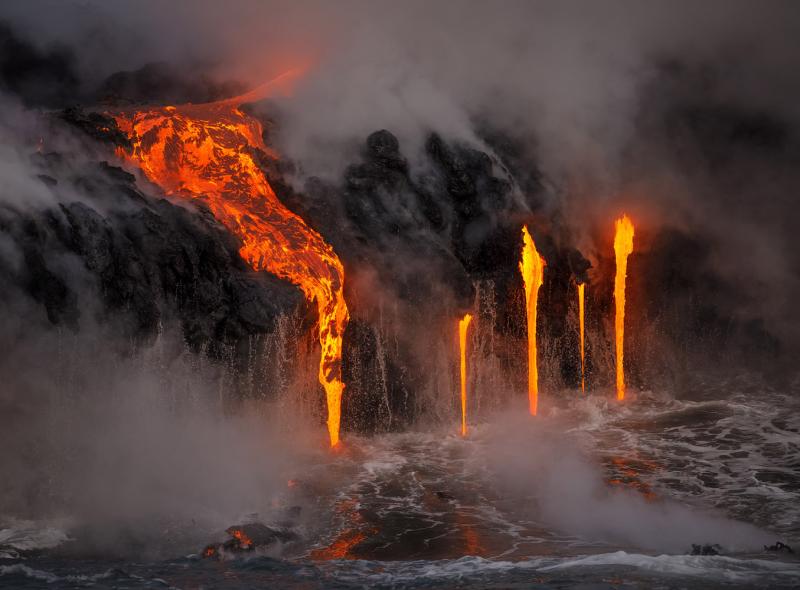
Sometimes, there's no reason why supposedly distinct elements should be considered separate and not treated as one.
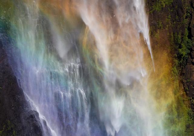 The waterfall and the rainbow are essentially one element.
(Canon 5D4, Sigma 150-600mm, 1/1250 sec, F6.3, ISO200)
Below is an example of a poorly composed image. There is a serious lack of balance (image is right heavy) and the main element lacks separation from similar elements in the background.
All of these examples show that discretion is needed when deciding where to separate and where to overlap. The more experienced you become, the easier it is to judge.
A few more comparisons:
 A terrible lack of separation between similar elements, together with dead space in the upper left, makes this composition confusing and unattractive.
(Canon 5D3, Tamron 24-70mm F2.8, 1/320 sec, F10, ISO200)
 Much better: the main foreground and background elements are well separated. Background elements are blurred by fog, which helps separate them from the foreground even though there is some physical overlap.
(Canon 5D3, Tamron 24-70mm F2.8, 1/320 sec, F8, ISO200)
 Again, a pretty awful picture with a gross lack of separation between the two segments of the iceberg. What a mess.
(DJI Phantom 4 Pro, 1/80 sec, F5.6, ISO400)
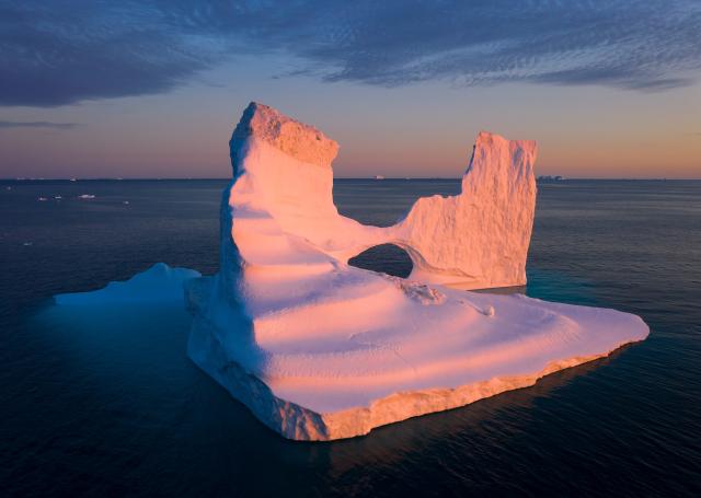 Here, not only are the cloud and the iceberg separate, but they're separated in a way that really complements the composition: the outline of the cloud matches the position of the left tower.
(DJI Mavic II Pro, 1/30sec, F8, ISO100)
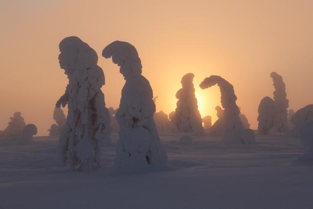
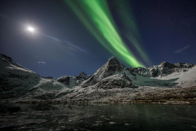 A beautiful situation, but the image suffers from the lack of separation between the aurora line and the mountain top.
(Canon 5D4, Canon 11-24mm F4, 8sec, F4, ISO3200)
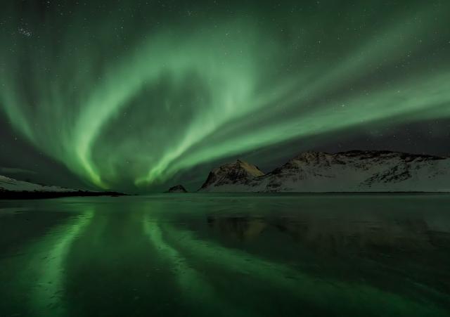 All Aurora lines are well separated from each other and from the mountain. Both the mountain and its reflection have enough "breathing" with respect to the lights and boundaries of the image.
(Canon 5D4, Canon 11-24mm F4, 8sec, F4, ISO6400)
Separation from the edges of the image
Separation of elements doesn't just mean separation from each other. Almost equally important, it means separation from the edges of the image . Even this consideration is ignored by many and often the results are bad.
In general, the eye wants to see an element in its entirety. From top to bottom, left to right, the eye is curious and sensitive and doesn't like to be deprived of what it wants to see. Cutting an element in the middle (or in the middle or its cool part ), not including its bottom, and placing it too close to the edge of the image (thus depriving an element of its own negative space, which is an extension of that element) they're all common mistakes (generally speaking) that can easily be avoided with a little attention and greater awareness.
In the image below, the foreground, textures, clouds and colors are really nice. But it suffers greatly from rocks in the top right and center left too close to the edges of the image. This is intimately connected to the lack of negative space, but it goes further by depriving the eye of the ability to go where it wants, thus creating a feeling of unease. Recalling what was said in previous articles, I would say that there is a dead space in the middle, also related to the positioning of the elements in the frame.
The image below has both good and bad examples of separation. I like how the shaded trees are in front of the lighted part of the dune, and the lighted tree in front of the shaded part of the dune (a nice example of parallelism). But one tree overlaps the shadow of the one to its right, and the leftmost tree is not separated by the edge of the image at all. What would you have done in this case?
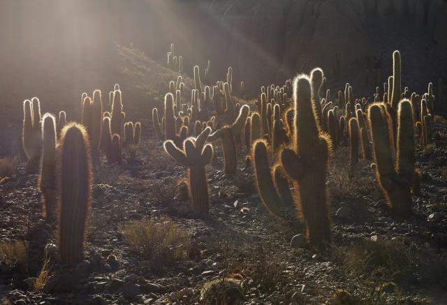
In the image below, there is significant overlap between the cacti. But that doesn't detract from its appeal as they are, in a sense, separated by the backlight-induced halos on their spines. This helps maintain the feeling of depth despite the lack of physical separation. The important thing here is that on both sides the masses are properly separated by the edges of the image.
As you can see, the more we delve into our reasoning on landscape composition, the more we realize that there are many elements that can determine the success of a photo. In the next article we will talk about depth. I am waiting for you.
When you subscribe to the blog, we will send you an e-mail when there are new updates on the site so you wouldn't miss them.
About the author
By accepting you will be accessing a service provided by a third-party external to https://www.insightadv.it/


Comments