
The inclusive world of multi-sensory typography
What happens when designers embrace the senses beyond sight?
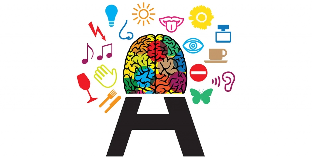
Design doesn't exist in a vacuum. We are constantly and simultaneously surrounded by textures, contours, smells, sights and sounds. As designers, we should consider all of the senses when designing, not only to connect more fully with our audience, but also to be more inclusive.
Each person brings their own individual story with them when they experience a design. The scent of chalk or the sound of screeching against a chalkboard can evoke memories of elementary school. Drinking hot cocoa by the fire can take you back to the holidays of long ago. As graphic designers, we often overlook many of the senses beyond sight, but fonts and design are multi-sensory experiences that can tap into everything from touch to sound.
When we design for all five senses, we create a richer, more meaningful and more personal experience for all people while accommodating those who may need to rely more on one sense. Historically, designers have not made much use of the multisensory opportunities available to them, but an increasing number of designers and artists have begun to use tools other than purely visual to include a wider audience.
Meg Miller in her article "Is It Art, or Is It Type? What We Learn When Language is Built, Not Written" , writes about how designers of type often “think of language as something physical, as matter. They also take it apart and reassemble it, building an alphabet from its constituent forms”. When designers consider the characteristics of type ( how would it feel? What would it smell like? What flavor would have the character?) through personification, physical construction and other means, open new doors for user experiences.In this article, we will jointly explore some senses that designers have embraced.
The sense of touch
The origins of typefaces are tactile: letterforms were carved into stone and pressed onto paper. However, today most people encounter characters digitally, excluding it from traditional tactile experiences. However, there are ways to evoke the sense of touch through lettering, even if it's only conceptual in nature. For example, almost everyone knows what it's like to be cold or hot, to burn your hand, or to feel pain. Translated into typography, designers can evoke the feeling of warmth through burnt type or cold through ice images. Artist Sair Göetz has drawn on this innate knowledge for a recent work titled “IVECHANGED,” which integrates large letters constructed from ice.
Göetz, head of collections planning at the Letterform Archive , is an artist whose work "seeks to exploit the weightlessness of language to process, manipulate and annotate the important issues it circumscribes." It does this through a combination of physical performances, videos, installations and signage. During the performance of "IVECHANGED", a group of 20 friends took large ice letters reading IVECHANGED into the Olentangy River, where they floated until they melted in the water. While this was happening, the artist read Deb Olin Unferth's 'To Be Honest', changing the pronouns in the poem/essay to neutralize the gender.
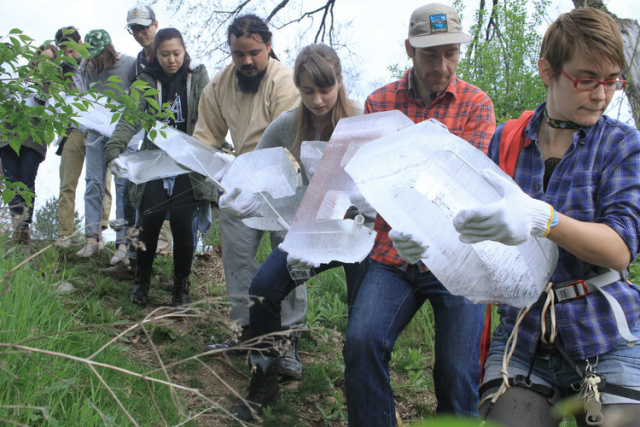
Through this work, Göetz explored the physical and metaphorical heaviness of words, together with the ephemeral nature of materials. “Speech has a weightlessness compared to writing or physical text,” she said of her work. "One of my goals with the ice font was to have something that starts out heavy and melts, just like tongue does, so that written words could have the ephemerality of spoken words." "IVECHANGED" is a coming out piece, even as Göetz reflects on how "coming out is an endless process", as one must constantly reiterate that it doesn't necessarily fit all systems as others might.
In a sense, all senses involve touch. We see because of the way light hits our eyes. We smell and taste as the particles enter our nose and land on our tongue. We hear due to the physical vibrations in our ears. In essence, everything we experience relates to how we touch the world and how it touches us. As Diane Ackerman , poet and author of A Natural History of the Senses says, "The mind doesn't actually dwell in the brain, but travels throughout the body on caravans of hormones and enzymes, trying to make sense of the compounded wonders we catalog as touch." , taste, smell, hearing, sight.As a designer and typographer, we have to consider all the senses.
The sense of smell
In A Natural History of the Senses , Ackerman writes, "Nothing is more memorable than smell. However, when we try to describe a smell, words fail us like the inventions they are. The physiological links between the centers of smell and brain language are woefully weak, not so are the links between the smell and memory centers.Our sense of smell can be extraordinarily precise, yet it is nearly impossible to describe the smell of something to someone who hasn't smelled it (e.g. a new book, lilac).” For designers and typographers, smell can be one of the most difficult to exploit, especially since most of our devices integrate sight and sound, yet few allow for the integration of smell or taste.
While designers are rarely afforded the luxury of incorporating smell into their work through specialized printing techniques, they can still stir emotions by evoking the memory of a scent. Smell is inherently visceral; when people see a character rotting away, for example, they immediately feel disgusted based on previous experiences. Packaging designers often play with this phenomenon with designs and fonts based on a product's scent, but exhibition design is where smell can be fully realized.
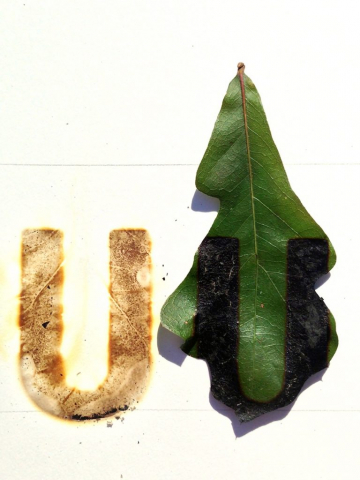
Graphic designer Cassie Hester has created a series of works titled ' Build It Up to Burn It Down', for which she melted a series of bronze marks in Univers Condensed and then burned them through leaves and linen thread into paper. While exhibiting her work, Hester said visitors could smell the font before seeing it. The scent hung in the air a bit like the remains of a bonfire. In designing with smell, Hester reflected that “smelling can be tricky, because she has chosen to avoid the gross and the synthetic. Finding the most satisfying fragrances are those that emerge naturally as part of the process of creating the 'Opera".
Hearing
When it comes to fonts, sight and sound are closely linked. As writer Robert Bringhurst aptly described it : "Writing is the solid form of language." Designers often convey the concept of sound through scale and weight. For example, a 72-point heavy Helvetica is much louder than an 8-point Mrs. Eaves . A layout with lots of white space will feel much more relaxing and quiet than a tiny margin spread filled with content .
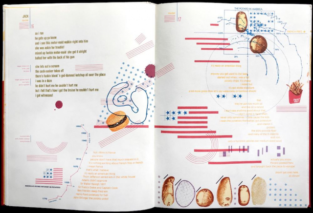
In the book " French Fries ", the designer Warren Lehrer has created a layout that choreographs the sounds, dialogues and interactions between the characters and their relationship with the place (in this case an American fast food restaurant). He chose a custom typeface, style, and color for each character in the book. When a political argument breaks out (set at the height of the Cold War), we can practically hear the overlapping voices and strongly held beliefs against the din of a video game arcade at the back of the fictional Dream Queen restaurant. The typographic design reflects the sonic environment or what Lehrer calls the "psycho-acoustic" environment as it engages readers to discern foreground from background noises and to navigate between legibility and chaos.
The taste
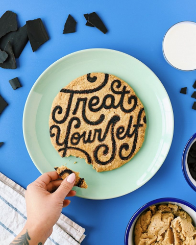
It's fun to play with food, typographically speaking. The physical properties of foods are varied and rich, they have incredible textures, colors and shapes that make them an excellent working medium. Food invites a sense of play and draws on deep associations. For example, if someone carves "summer" into a piece of watermelon, it recalls specific memories and the flavor of a sweet, juicy watermelon. Another wonderful property of food is that its shape can change over time during cooking: sugar caramelizes, dough turns into pretzels, popcorn kernels can become crackling corn. This evolution is a tool that can be used for creative ends, but it's also why edible characters are temporary, by nature.
Lauren Hom, the lettering artist behind Hom Sweet Hom , often works with food as a writing medium. He says cooking is "baked in his DNA." Hom recalled how growing up her mother made cheese snacks and crackers for her and her brother and cut the slices of cheese into the letters of their names. Today, Hom draws letters using foods such as coconut milk, biscuits and flour. She says her work has been compared "to sand art and the temporary nature of it all." Photography is the primary way audiences interact with her food lettering, meaning she's often the only person who gets the full experience of smelling, touching and savoring her work.
Lauren decided to enroll in a culinary school to bridge the gap between her work as a typographer and her love of cooking, in order to then be able to open her own restaurant. She sees the incorporation of food into her art as an expansion (not a pivot) and says "art will always be a central part of my work."
Intersection of the senses
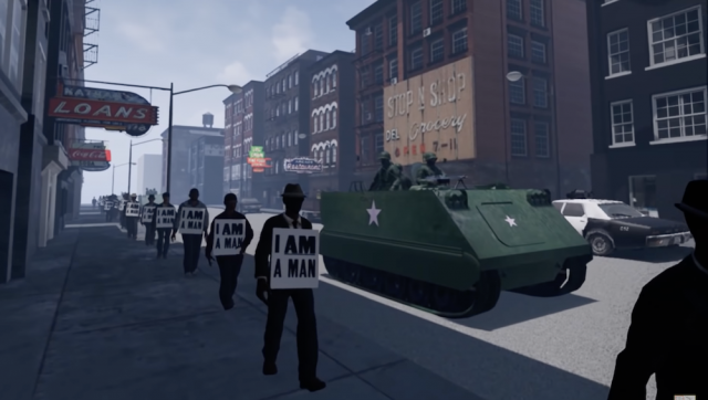
Fully immersing audiences in sensory design is a challenge, but designers are exploring how to do so through mediums such as virtual and augmented reality. In one compelling example, Derek Ham, head of Art + Design at the state of North Carolina, created “I Am A Man ,” an interactive Oculus Rift VR experience about the African-American civil rights movement. During the experience, viewers walk through the Memphis Sanitation Worker's Strike of 1968 and witness the events leading up to the assassination of Dr. Martin Luther King, Jr. By merging images, audio and interactive motion, Ham creates an emotional connection with his viewers .
Ham believes audio is one of the most underrated elements in design. “The graphic design profession rarely focuses on audio components, but when I really want immersion and connection to space, both big and small strokes of audio design paint the scene,” he says. Ham recalls how, as an undergraduate architecture student, he had a professor who was strongly focused on the senses. Once his class made a site visit and the professor asked the students to close their eyes and listen. Then he asked: “What is the quality of the site? What is the tactility of the terrain?” Ham said that the memory of that moment is always fresh with him and that a textured background sound accompanies everything he sees. This feeling is prevalent in “I Am A Man” and Ham says which he hopes will make this piece of history more real for those who haven't experienced it firsthand. “If we use immersive environments to talk about history, it will be real. I also think about this in relation to racism. What we do with history, often, is distance ourselves. But immersive technology can re-humanize events ."
As a visual communications designer, I often find myself relying too much on the purely visual. Design is not just to be seen. It is also meant to be heard, smelled, tasted and touched. Designers feel character, through calligraphy, 3D printing and building installations. Viewing the shapes of letters can even influence what our other senses perceive. We eat lettering on birthday cakes without thinking about it. Does Hershey's taste like chocolate? Can a brand have a flavor? Would the chocolate taste different without the text? Blind taste tests say it would, as studies have repeatedly shown that people perceive different flavors depending on which brand they think they're tasting.
When you subscribe to the blog, we will send you an e-mail when there are new updates on the site so you wouldn't miss them.
About the author
By accepting you will be accessing a service provided by a third-party external to https://www.insightadv.it/


Comments