
Gestalt: what it is and how it applies to Graphic Design
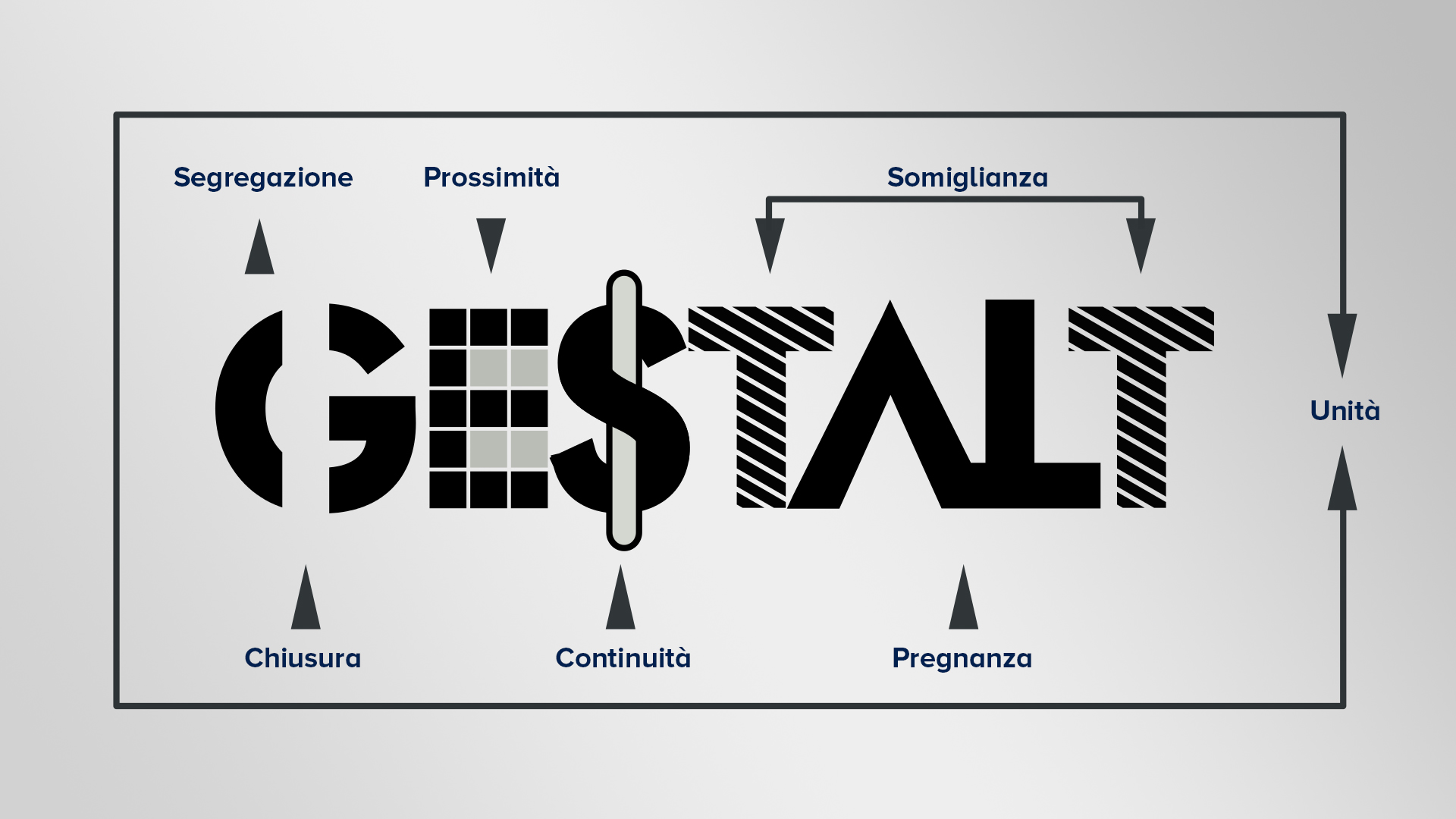
Today we're talking about one of the things that fascinate me the most about graphic design: Gestalt psychology, its principles and how it applies to graphics.
Gestalt, pronounced gheshtalt , is a German word which in Italian means "form", "unitary structure", "harmonic configuration"...
Gestalt psychology is a psychological current that developed at the beginning of the 20th century, in Germany , in fact.
It is a psychological current that mainly studied the perception of forms and experience. It is also linked to the psychotherapy of Gestalt Therapy , a post-analytic school developed in the USA in the 1950s in the field of humanistic psychotherapies.
At the basis of Gestalt psychology is this sentence, uttered by a German psychologist:
“The whole is different from the sum of the individual parts”. – Kurt Koffka (1886 – 1941)
Often this phrase is erroneously reported as " the whole is greater than the sum of its parts ".
Unfortunately, this is an error handed down from a bad translation from German about 100 years ago, we mention it only for completeness of information.
Gestalt psychology
Kurt Koffka's famous phrase, at the basis of Gestalt, essentially means that we human beings perceive elements differently depending on the whole to which they belong.
We do not perceive the individual elements next to each other, but we perceive something different .
Let's take an example immediately, to better clarify the concept: the dotted line between the lanes of the roads. We do not perceive the individual dashes as distinct and separate elements , we perceive them as a single element, a dotted line.
The whole is different from the sum of the individual parts.
Another example is Christmas lights , you know, right? Those strings of small LED bulbs that light up intermittently. When they light up one after the other, our brain doesn't perceive each individual bulb turning on and off in sequence, but rather a single light that seems to pass from one bulb to another.
This is an example that I really like, because it makes us understand how Gestalt is not something linked to the classic two-dimensional forms, but it is something which is linked to any area of perception .
This theory, in the psychological field, is nowadays partially outdated because it is limited in certain cognitive fields. This does not mean that, throughout the history of design and visual communication, it has been able to identify certain principles and methods that are still widely used today, often, as we will see, unconsciously.
Gestalt in graphics
As any graphics enthusiast knows, behind any creative work there is planning and work. In fact, why does a business card created in a certain way, for example, manage to give a positive idea of us while another alienates our potential customer? Why do some logos capture more attention by remaining imprinted for a long time unlike others that instead fall into oblivion?
The answer is one: mechanisms connected to human psychology are hidden behind seemingly immediate elements. Just think of the psychology of colors which explains how to choose shades according to the message you want to send or the fact that we perceive each element differently, depending on the set it belongs to.
The reference to Gestalt Psychology fits into this context, whose slogan as we have seen was:
“The whole is not the sum of its parts”
Understanding why the human brain tends to interpret the set of different elements as a single message becomes fundamental in the graphic field to understand how the human eye analyzes a pattern and recognizes its forms (and consequently the unity of the message).
It therefore becomes essential to understand how to send a message which elements to use and how to arrange them to best communicate it to our audience.
The fundamental principles of Gestalt
Once you understand what Gestalt is, you need to understand what its principles are. In graphic design it is important to understand how the human mind relates to objects and shapes and try to outline some principles that remain valid in every occasion.
Proximity principle
The first principle of Gestalt is the principle of proximity , which states that within a composition or an image, elements that are close to each other are perceived as a unitary element.
In this example these nine circles, arranged in this way, make us perceive a square shape. But if you separate them with some space between them, they become three columns.
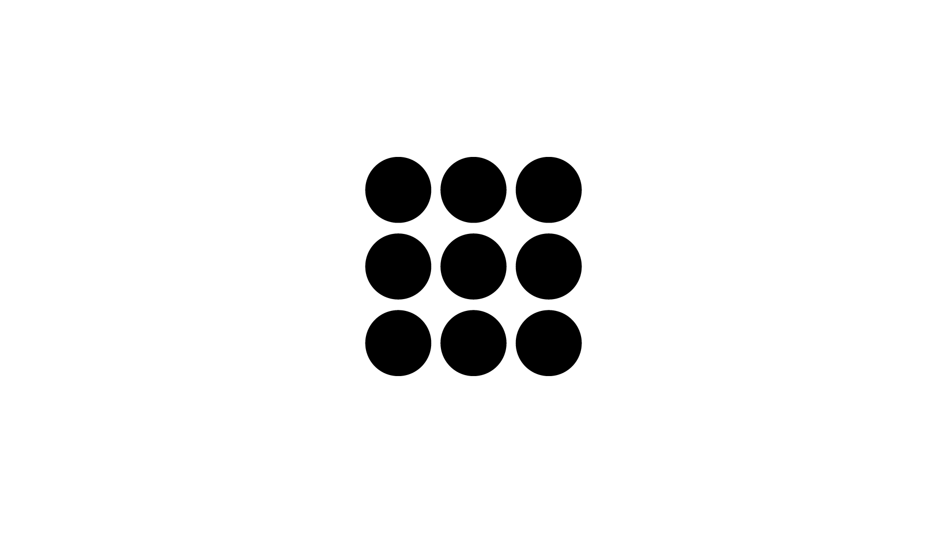
And again, if you add even more space and place them out of order on the page, you simply perceive nine circles arranged across the screen.
The principle of proximity applied to graphics
The most important example, in graphics, is that of columns and paragraphs of text and therefore of typography.
They work in exactly the same way, as long as lines of text are placed next to each other we perceive them as a single element : whether it's a paragraph or a column of text.
The moment we insert too much space between one line and another, the lines begin to seem to us as distinct elements from each other and not as part of the same text.
This principle is also the basis of good legibility of a text .
The same thing obviously happens with the space between words or between letters. If the space between the various elements is too much, we no longer perceive a unity between them.
But the proximity principle can be applied to other areas of graphic design, such as logo design.
Take for example the Unilever logo, designed in 2004 by the Wolff Olins agency .
![]()
This logo includes some of the many products sold by this multinational and are positioned in such a way as to form a U. This exploits the Gestalt proximity principle.
Or again, always remaining in the field of logo design: the IBM logo designed by Paul Rand . The concept is the same.
![]()
Similarity principle
The second principle is that of similarity. He affirms that within a composition or an image, similar elements are grouped together and perceived as a unitary element . This resemblance can be due to shape, colour, size or location.
In this example we perceive five different lines. The first group formed by rows of black rounds, and the second group formed by rows of white squares.
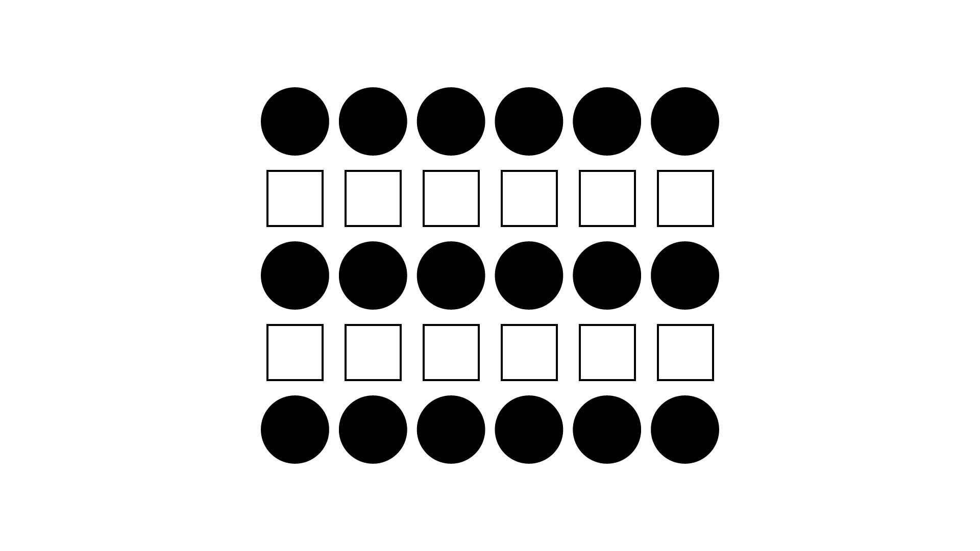
If they were all black circles, our perception would have told us that it was a rectangle, as in the proximity principle that I explained to you earlier.
The fact that they are different elements, but similar to each other, gives us an idea of five lines made up of black circles or white squares.
This principle causes our brain to group elements with similar characteristics to each other , and this can be exploited in many ways in graphic design.
The principle of similarity in graphics
All patterns and textures, for example, are based on this principle. But that's not all, even when building a series of icons.
Icons need to be similar to each other to work as a whole that is visually coherent.
Even if each icon has a different shape, it has similar characteristics to the others: it has the same colour, has the same thickness of the lines and the same graphic style and this makes us perceive them as a single whole.
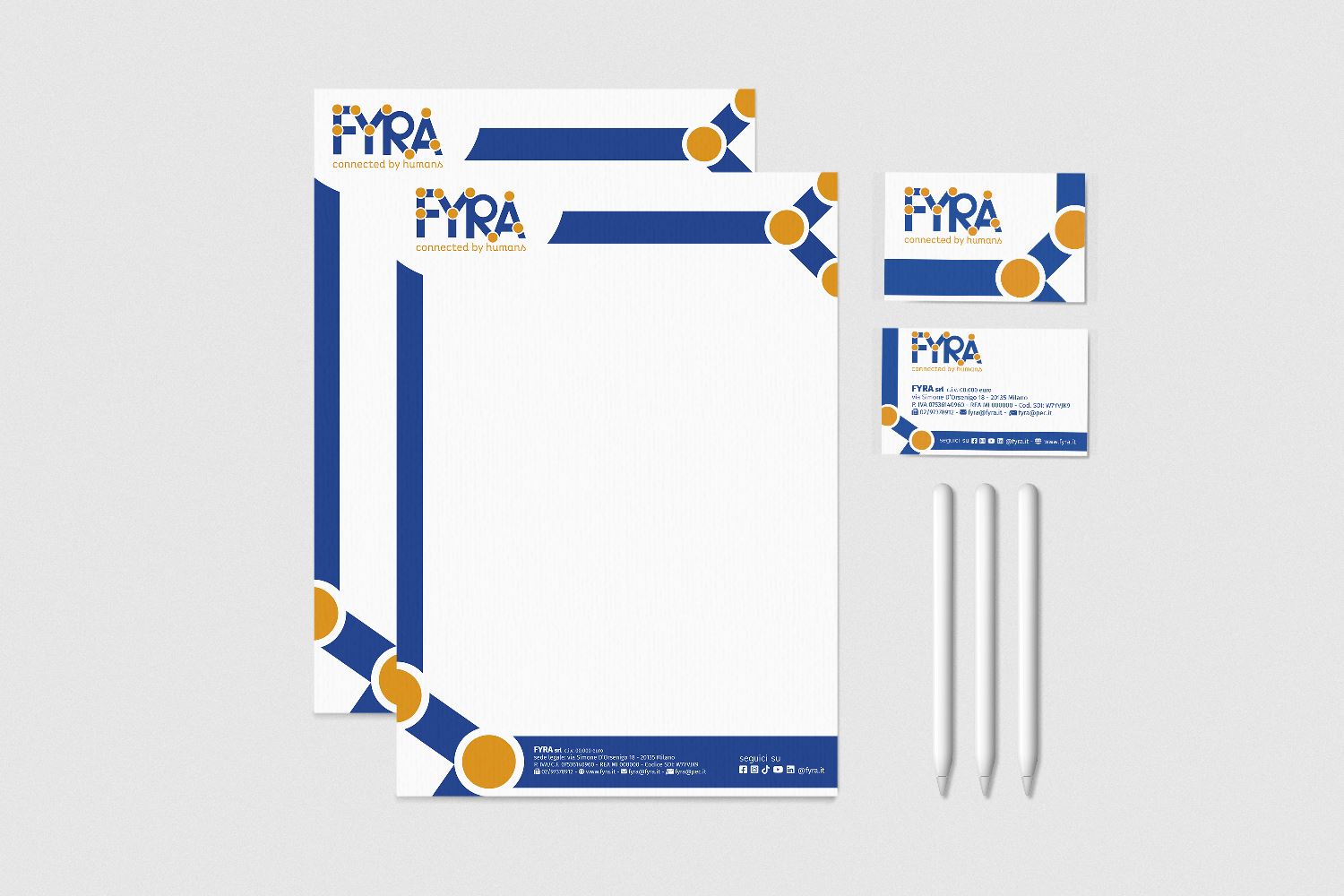
The same principle then applies to branding, to the design of a coordinated image .
When you go to build the coordinated image of a brand, in fact, you go to use certain elements by repeating them in every application of that logo or corporate coordinated material. Creating rhythm, texture.
As you can see in this example of the new Fyra brand identity , designed by our agency.
Principle of common destiny
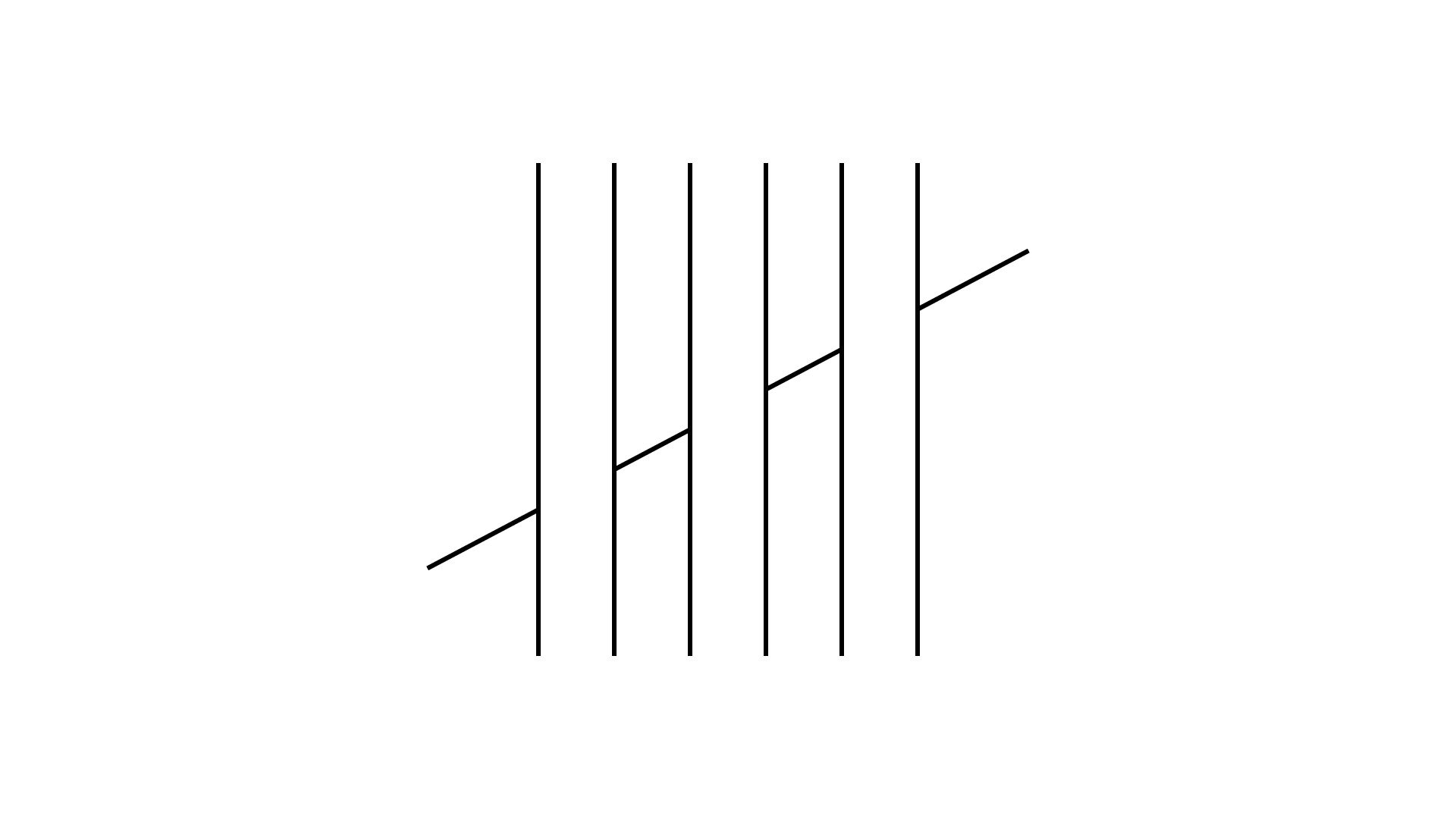
In the principle of common destiny the elements with a movement equal to each other and different from the others are grouped together.
In this example we perceive three vertical columns and a single oblique line that passes behind them. While in reality they are broken elements that we perceive as unique to each other.
Another example is with three silhouettes of three aircraft seen from below, which are perceived as a group of aircraft flying together in the same direction .

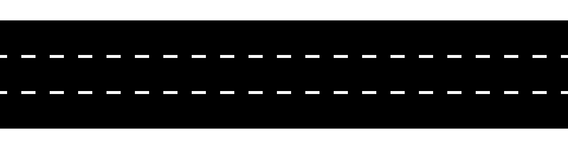
Principle of continuity
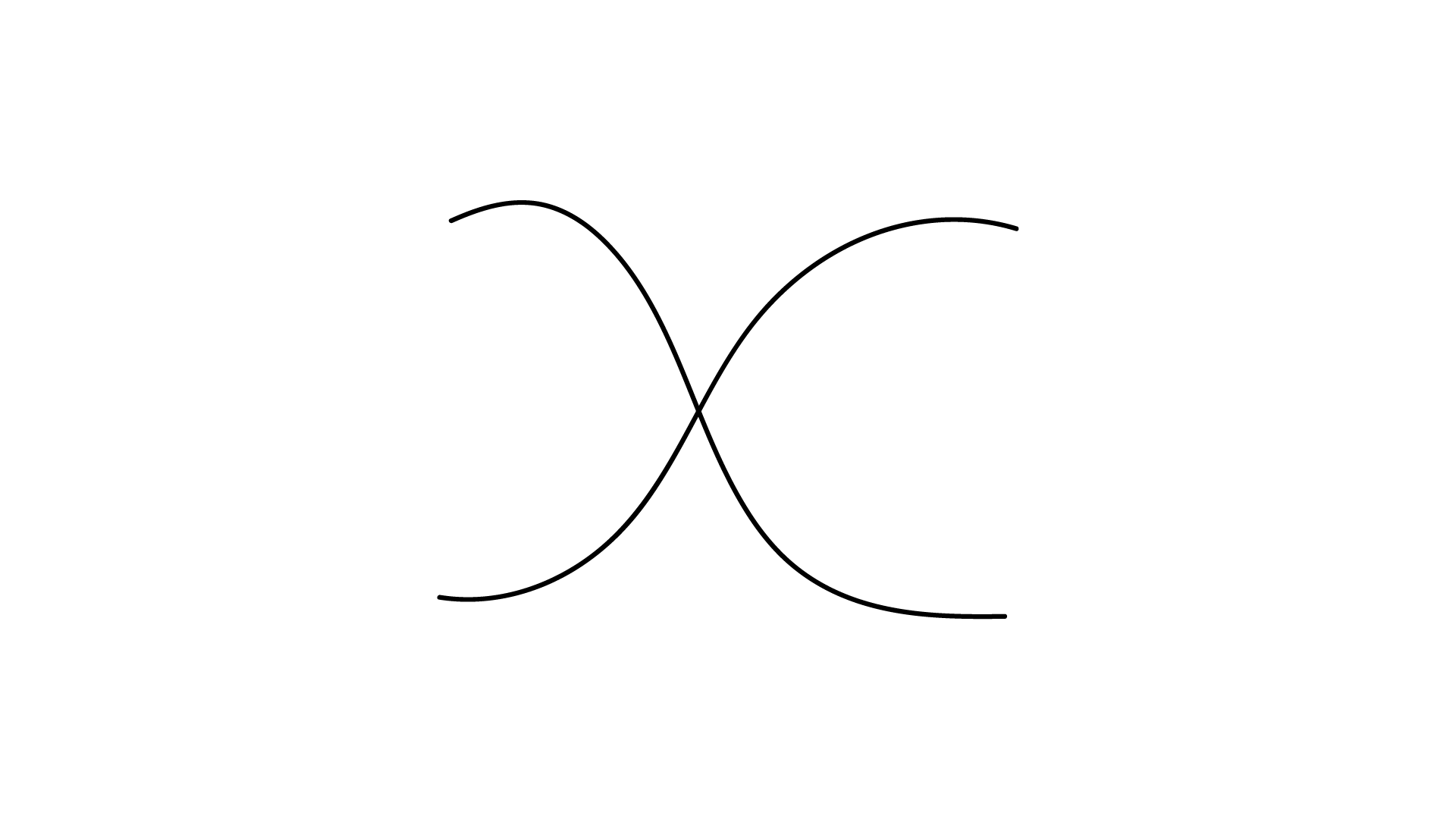
Very similar to the previous principle, of common destiny, but different, is the principle of continuity, where the elements are joined according to their direction .
In this textbook example, we perceive two curved lines, but in reality they could be four lines completely separated from each other, but simply placed visually in the same place.
The striking example is the dotted line of the roads which appears to us as a continuous dotted line , therefore as a single element, and not as separate segments, as I said at the beginning of the article.
In graphic design these principles are used in images to give a sense of harmony in movement , and to make the elements that are actually unrelated to one another perceived as one.
A very nice example, in logo design, is the logo pictogram for the Association des Hotels du Canada :
![]()
Principle of past experience
This is probably the most complex, but some practical examples will help you understand it.
According to this principle, experience shapes our perception. And therefore the elements of a set that manage to revive the perceptual experiences of a particular object are grouped together and form a figure.
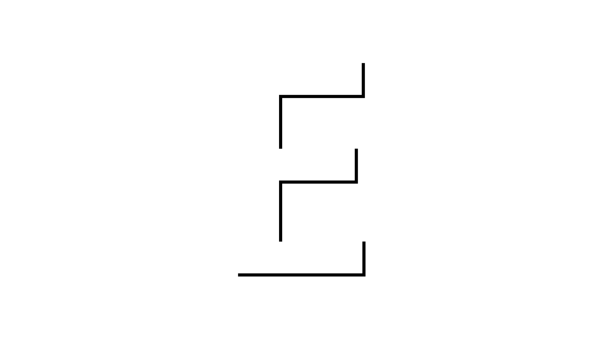
In fact, in this example we do not see three distinct segments, but we perceive very clearly a capital letter E. This is because we know the letter E, and lines positioned that way stimulate our recollection and cause us to perceive it, even though it's not actually there.
This principle is often used in combination with the next two, as we see in this logo designed by the Pentagram studio in 2018, for Vibia , which deals with lighting engineering.
![]()
We easily read the Vibia writing, even if it's almost all white and gray, but we perceive it thanks to our past experience and the next, closing principle (as regards the letter B).
Principle of closure or completion
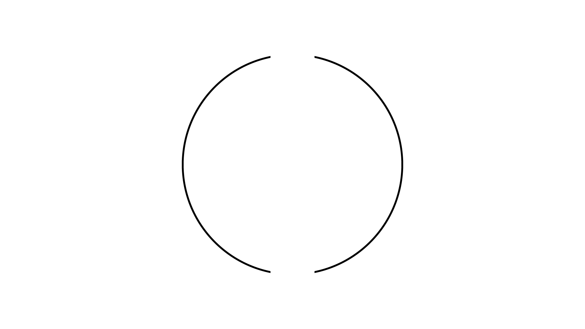
The first of the last two is that of closure or completion, which states that our brain tends to perceive closed forms, even if in reality they are not closed at all .
In this example we don't see two curved lines, but we perceive a circle.
Or in this other example, we distinctly perceive the figure of a square placed on top of 4 circles. But in reality, there are no squares or circles in this image.
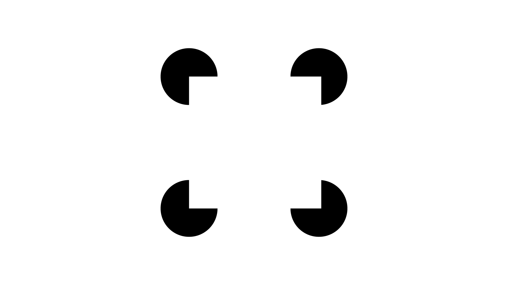
We tend to prefer closed shapes , and therefore even when a shape is not closed, our brain automatically completes it, reconstructing a shape based on the memory we have of that specific shape.
A famous example that exploits this Gestalt principle is that of the WWF logo , where we perceive the full form of the panda , even though we don't really see it in full.

We also perceive the part that is actually missing and thus complete the shape .
This also happens thanks to the previous principle, of past experience, since if we hadn't known what a panda looked like, it wouldn't have been possible to perceive it.
Principle of Figure/Ground
The last Gestalt principle is that of figure/ground, which in my opinion is the most interesting as an application in graphic design, because it allows for greater creativity .
A principle according to which we, in a composition, always tend to perceive some figures as an image and the others as a background.
In the end it's just how our eye works : when we talk to a person we distinguish that person's face from the background.
This underlies some of Gestalt's most beautiful optical illusions .
The most famous application is certainly the optical illusion of the Rubin Vase , in which we see both the silhouette of a vase in the black part and two people looking at each other.

The principle of Figure/Ground applied to graphics
Applications of the Gestalt figure/ground principle in graphic design are almost all accomplished through the figure/ground principle.
In fact, there are many examples in the world of logo design or illustration with this technique: giving the background and the figure two different meanings, which, depending on what is observed , can be understood or not.
An example often used in such cases is the logo of the Pittsburgh Zoo , which shows the silhouette of a tree as a figure and the profile of a gorilla and a lioness as a background.
![]()
Another very cool example is of the amazing logo of a golf club called Spartan .
![]()
In this logo, the figure of a golfer who has just hit the golf ball and the figure of a Spartan warrior can be seen at the same time.
When designing a logo , it obviously doesn't have to be as visually complex as these examples I've shown you. Indeed, it is usually better that they are simpler.
“The whole is different from the sum of the parts”
All these principles make sense of the slogan “The whole is different from the sum of the parts”.
Taken individually, all the elements of each example we have seen are meaningless, while grouped together they form a signifier.
Gestalt theory is therefore fundamental for any designer who wants to get the message of his work understood in a simple and immediate way.
Keeping these principles in mind can make all the difference in the success – or failure – of a business!
When you subscribe to the blog, we will send you an e-mail when there are new updates on the site so you wouldn't miss them.
About the author
By accepting you will be accessing a service provided by a third-party external to https://www.insightadv.it/


Comments